Identity and brand for lifting equipment manufacturer in Russia.
+ open project detailsNew Mechanisation is a young company in Russia whose specialization is lifting equipment. Like cranes, elevators, and cars for the construction sites. Whatever it is it should lift some heavy stuff.
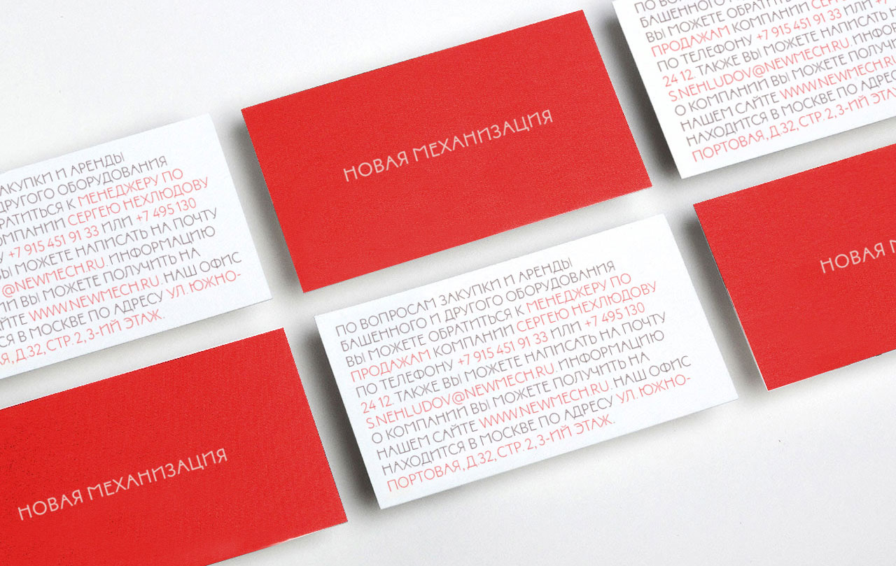
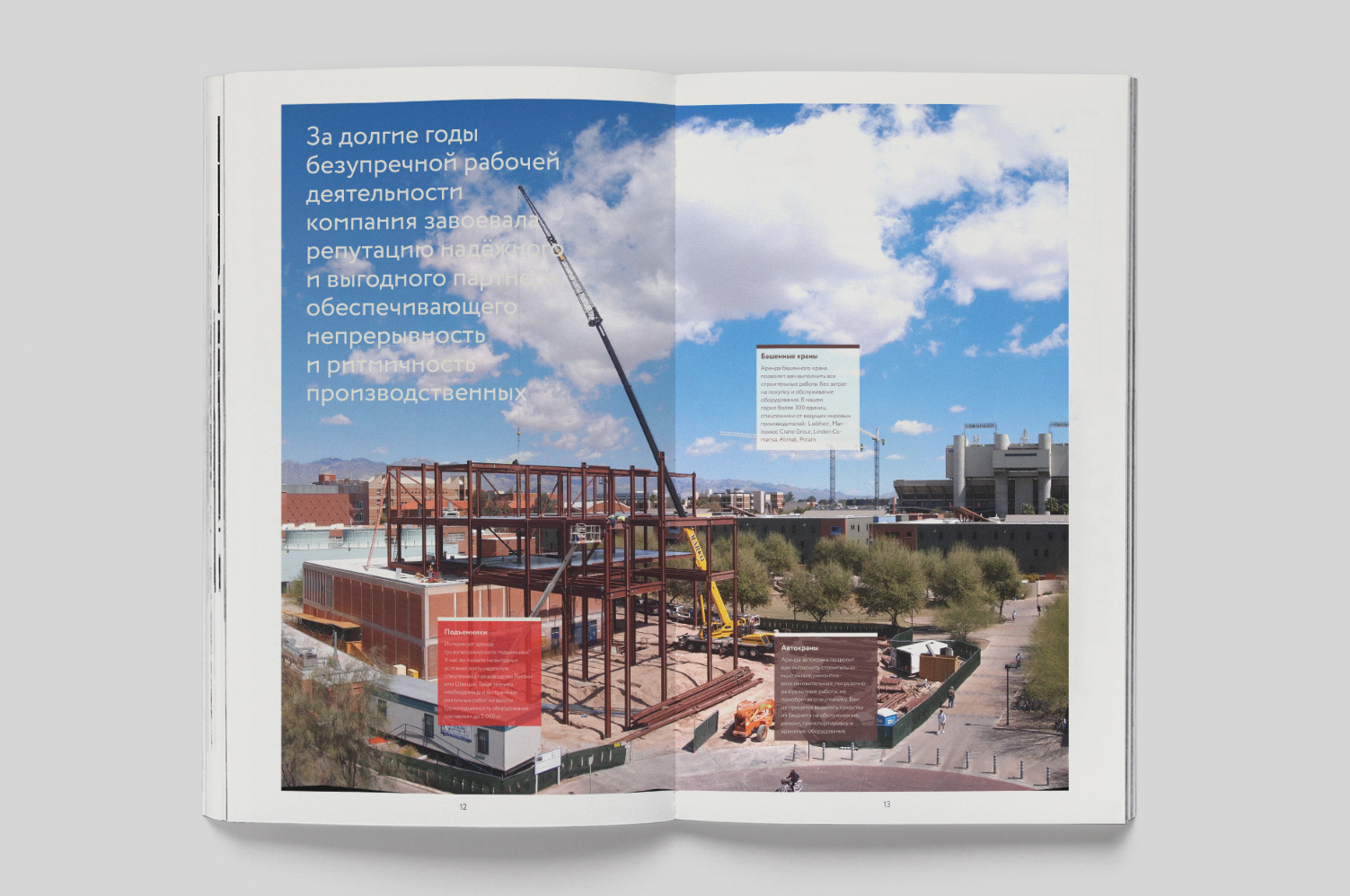
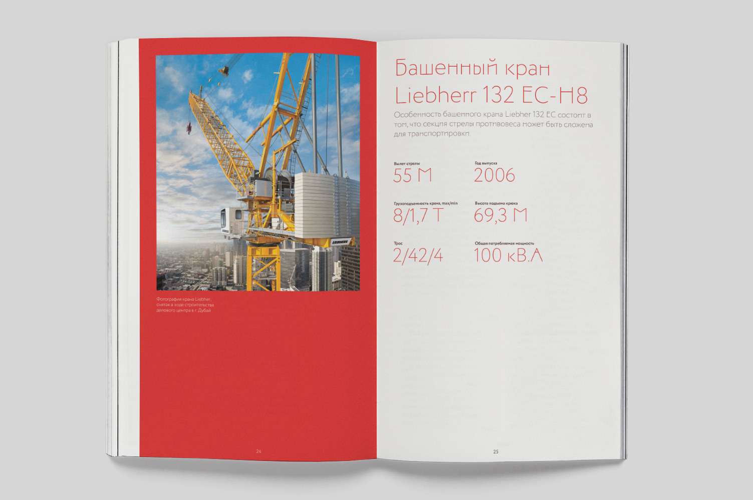
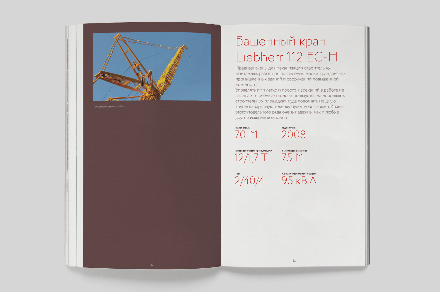
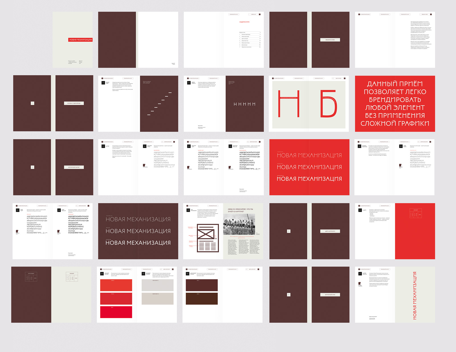
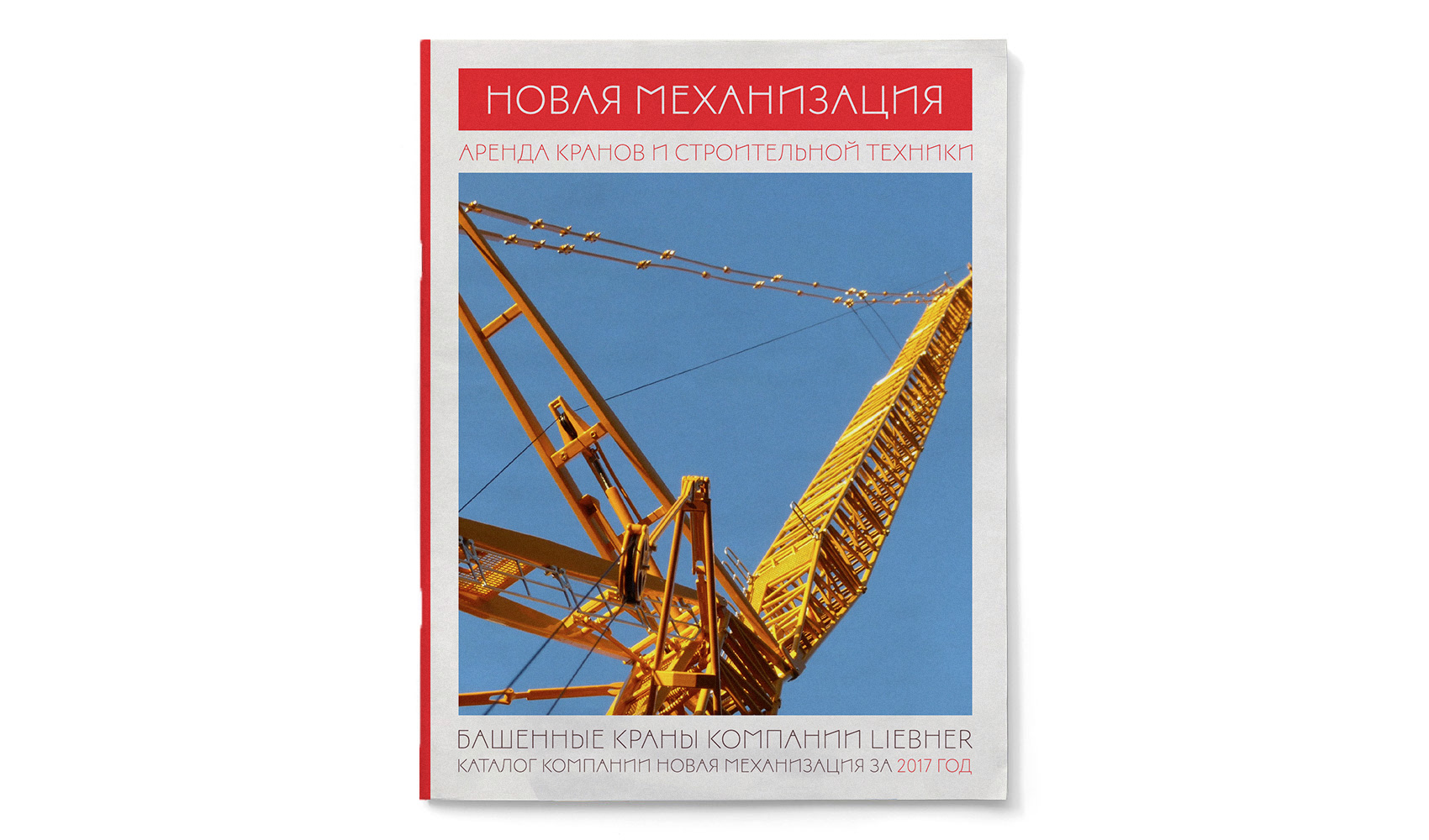
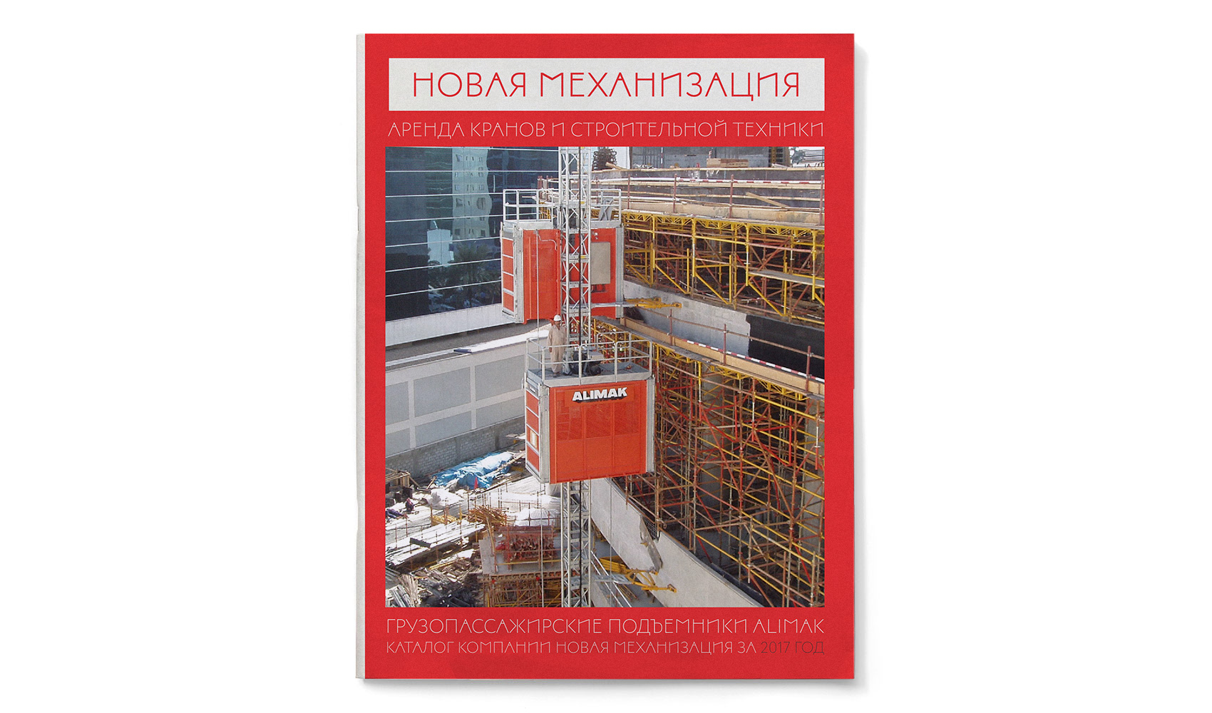
In 2017 we were commissioned to completely rebrand the organization, create the new graphical identity system and support while manufacturing print products.
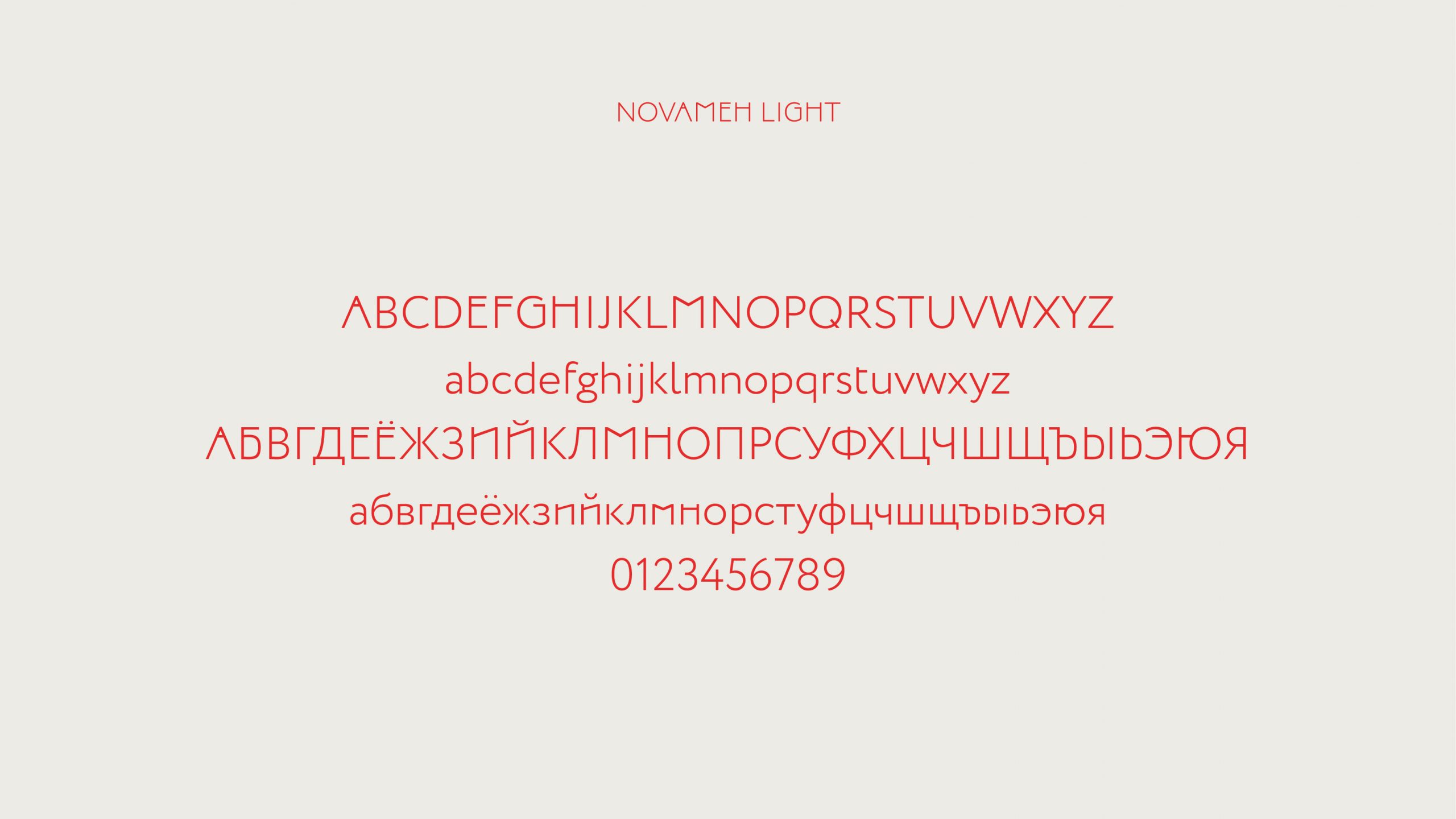
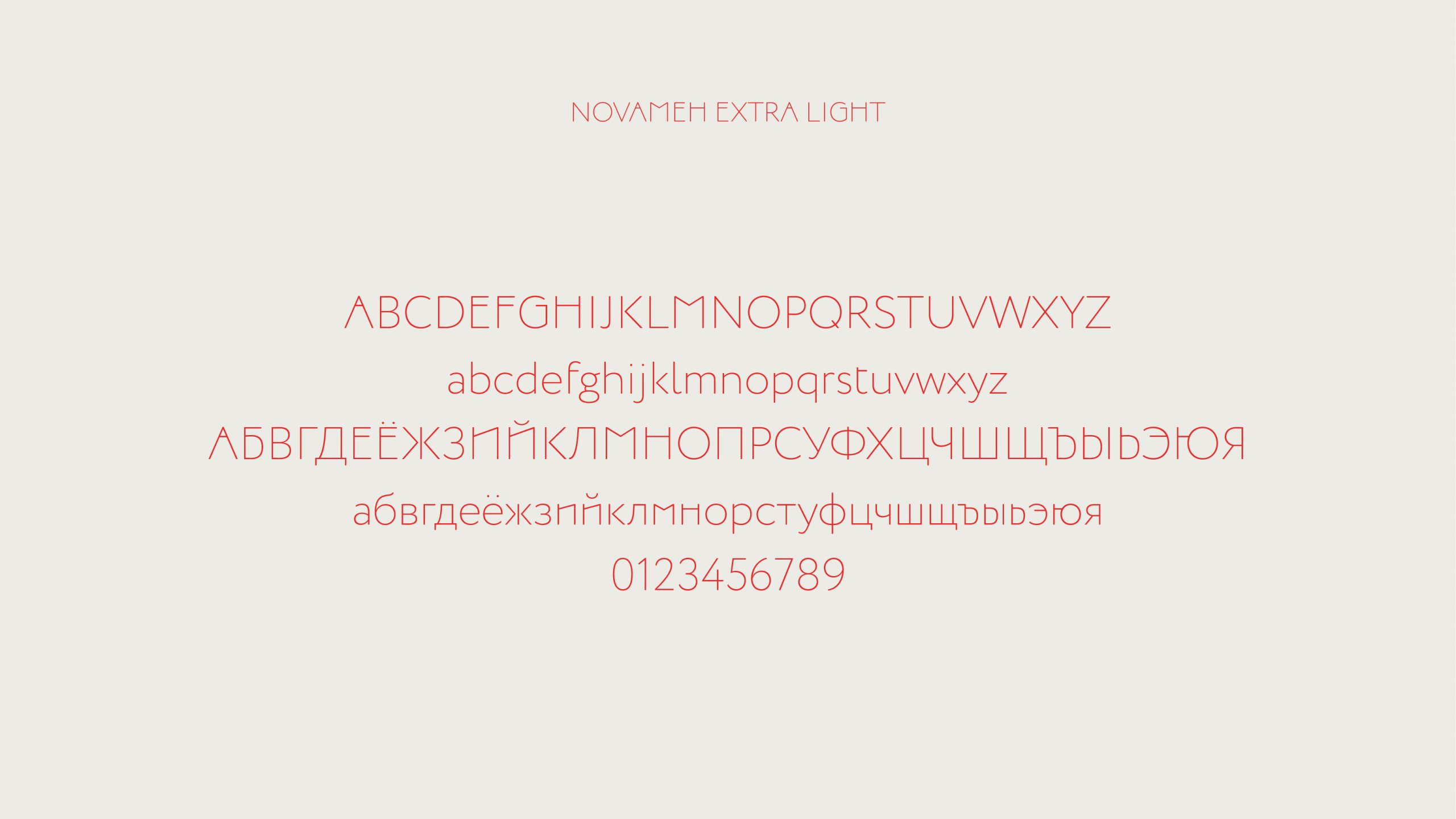
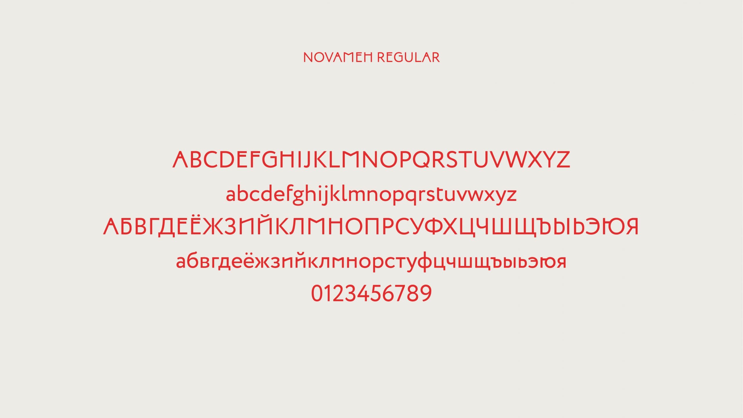
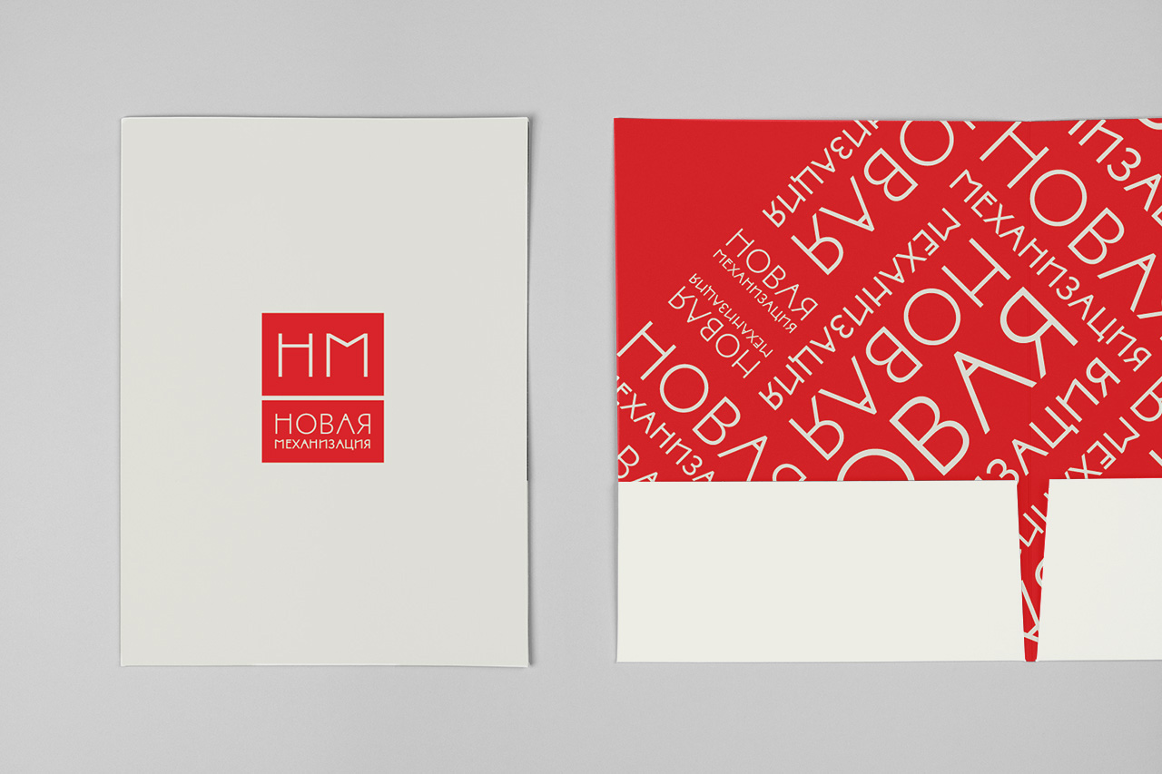
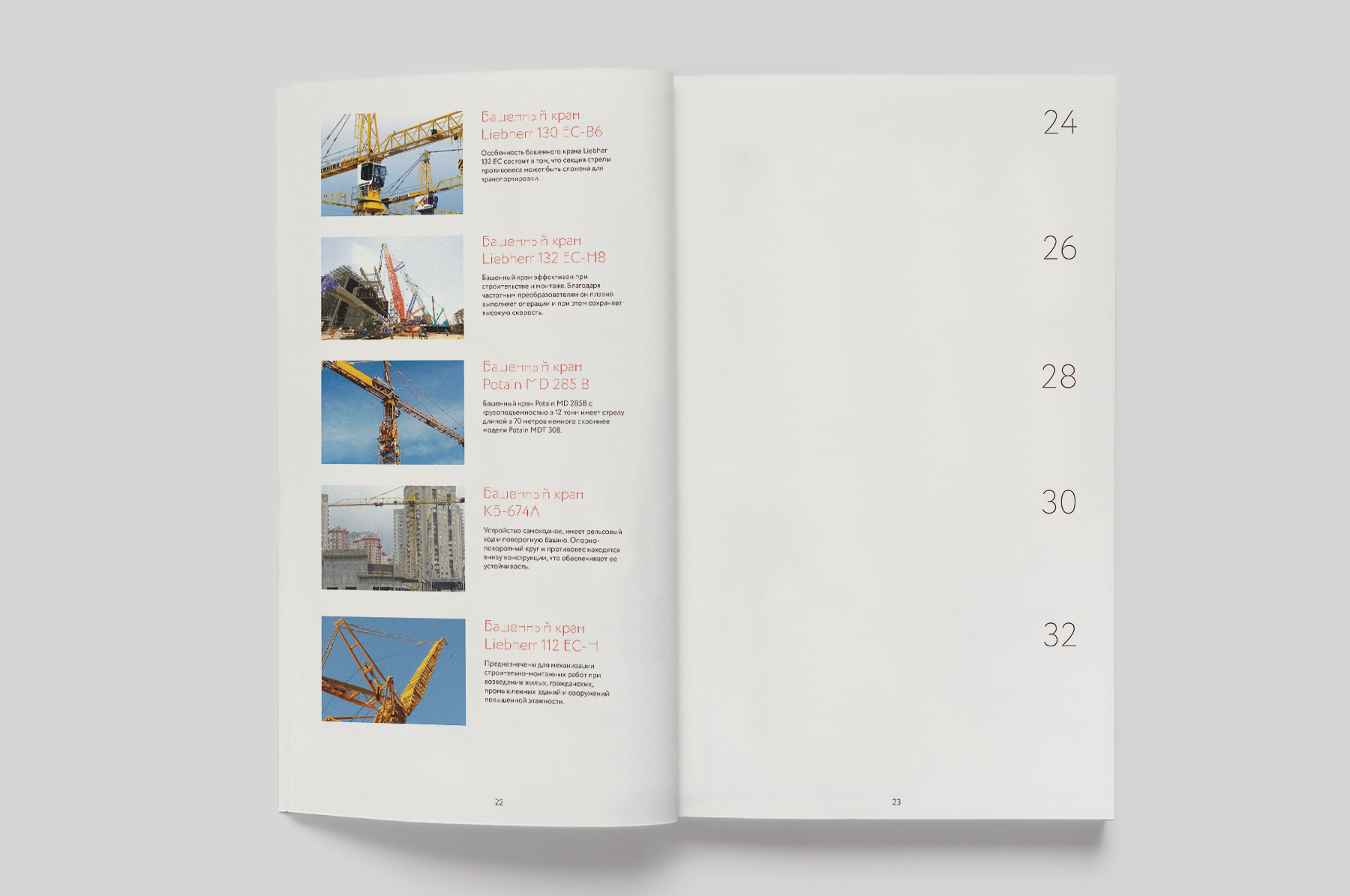
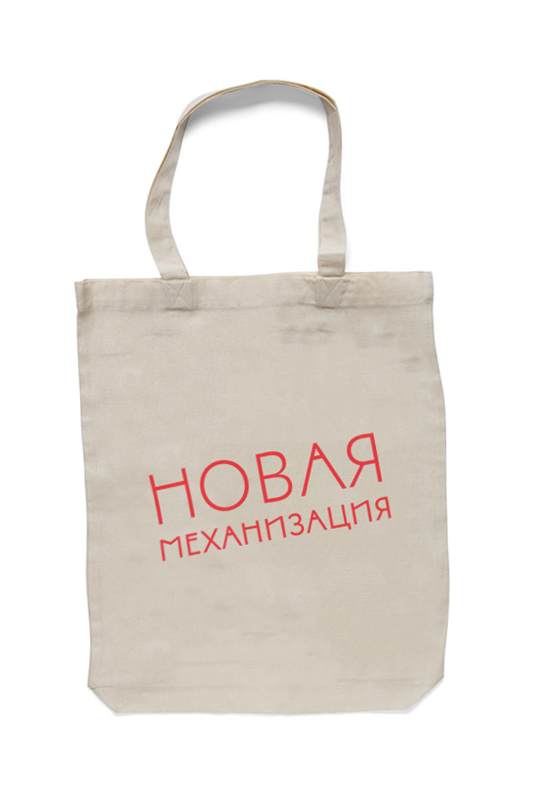
To create the graphical language we have integrated the metaphor of lifting something to the top into the typeface. As a base, we have picked the Circe Typeface and have lifted every horizontal element of every glyph to the top. These slight changes let us create a custom typeface that became the DNA of the whole brand. Integrating the NovaMeh font into print products, stationery and web design we have managed to develop a sold in powerful brand.
The brand is built on using the custom NovaMeh font which is created by integrating the metaphor of lifting something to the top into the glyphs.
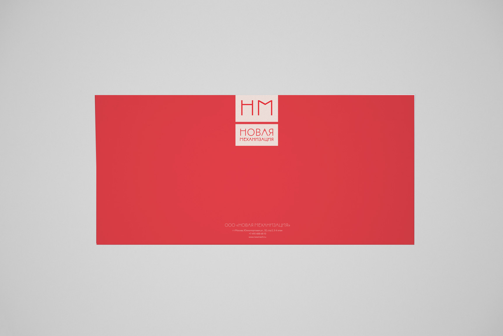
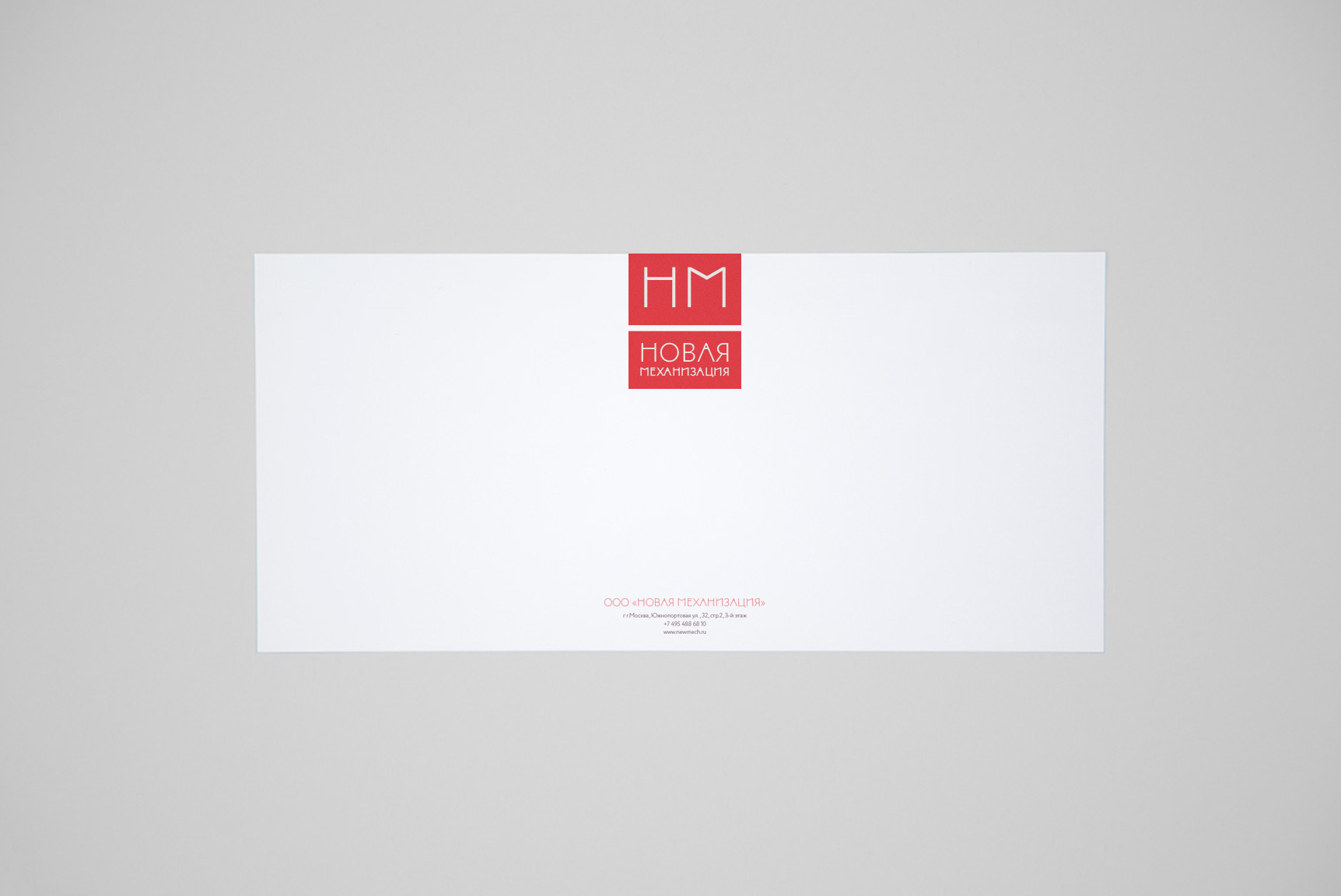
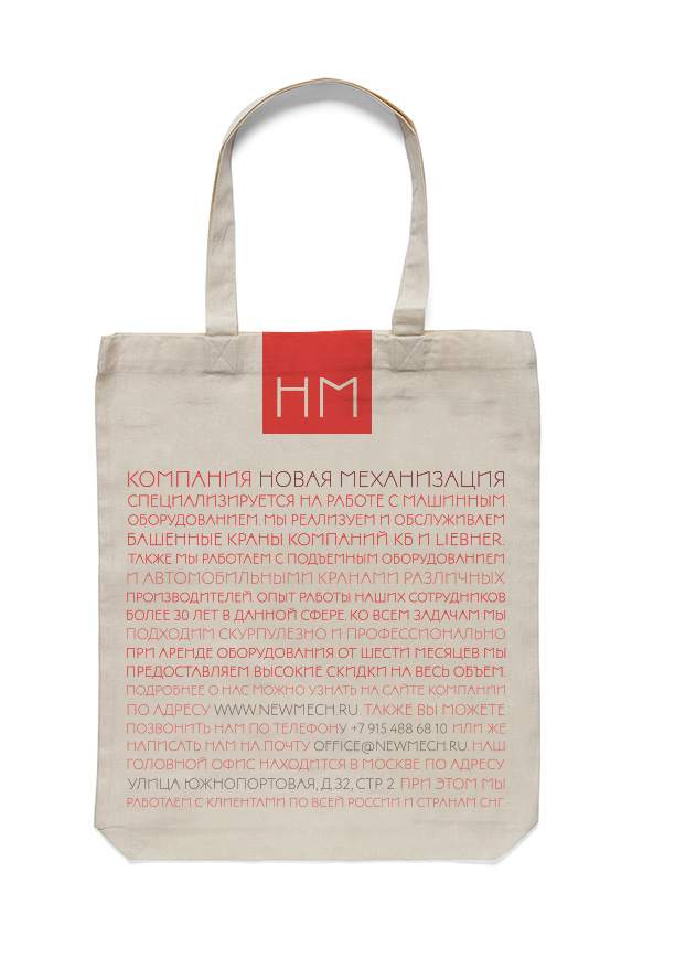
Though the main logotype version is a typographic one, we also have developed a short sign that can be used in case it is needed to add some brief identification. We have also developed the system of placing it.
We also have prepared a detailed guideline for the customer that explains that system in details.
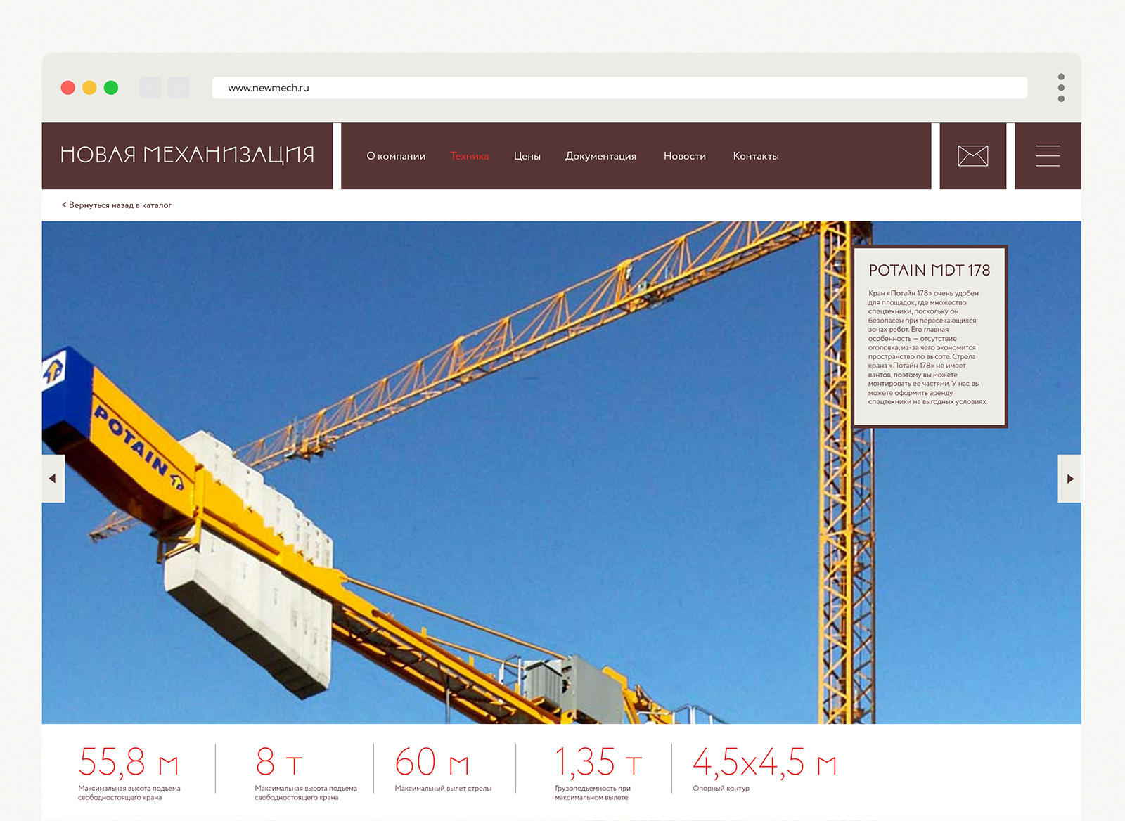
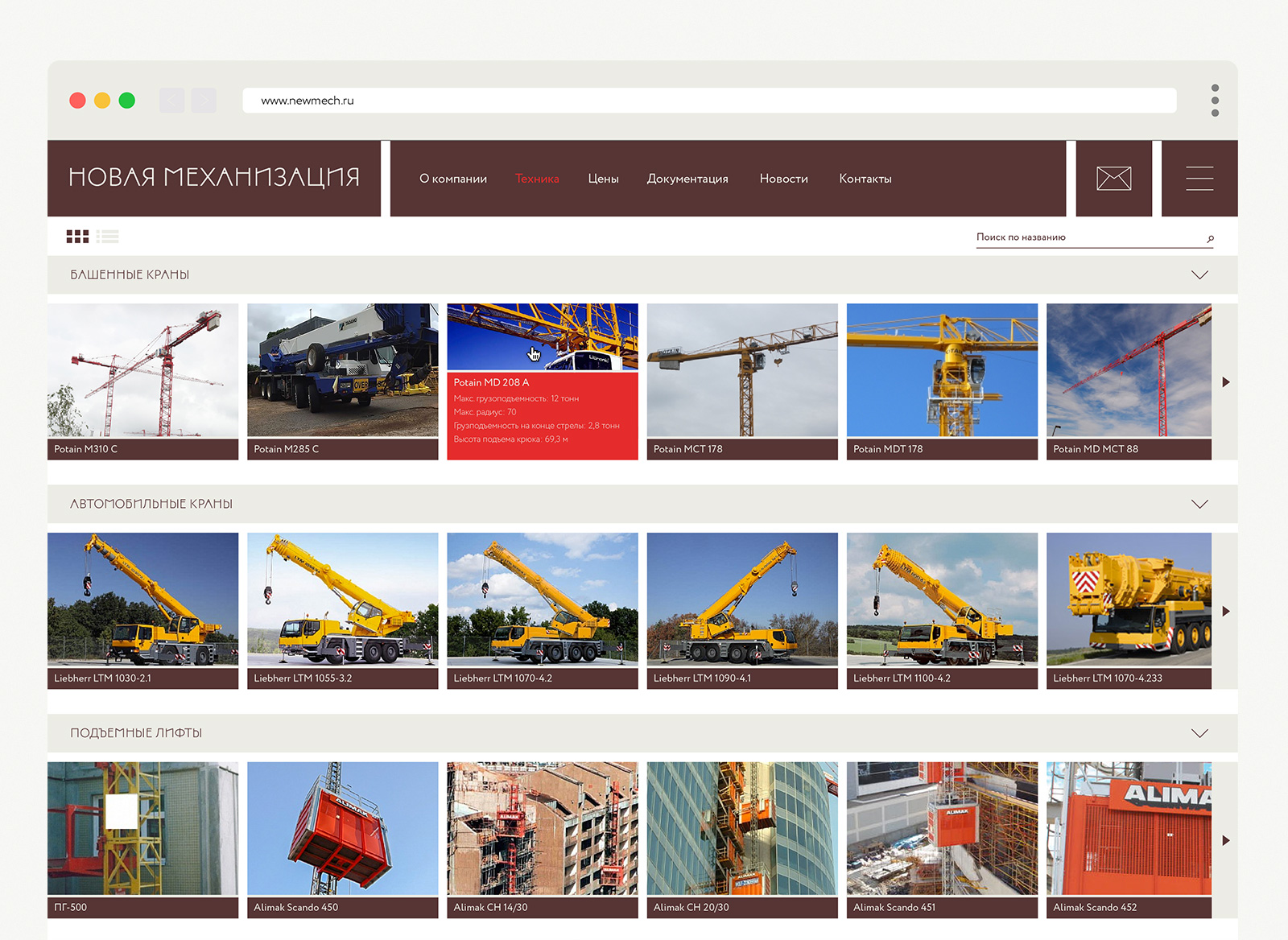
As a final step, we have created web pages design example so the client can create a web site that would use the full power of the graphical system.