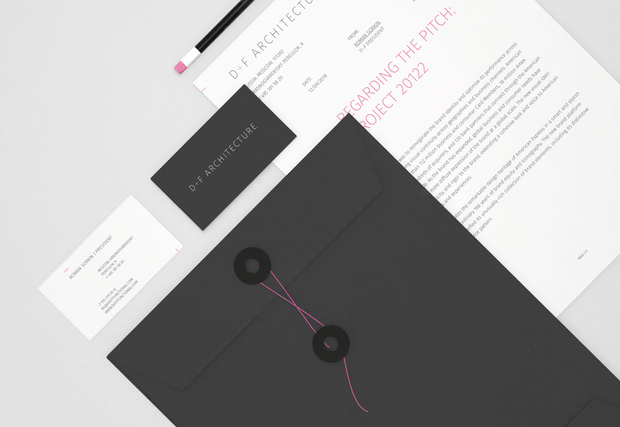
D+F is Russian-Israel architecture group. In 2018 we were commissioned to create light, minimalistic yet remarkable graphic language.
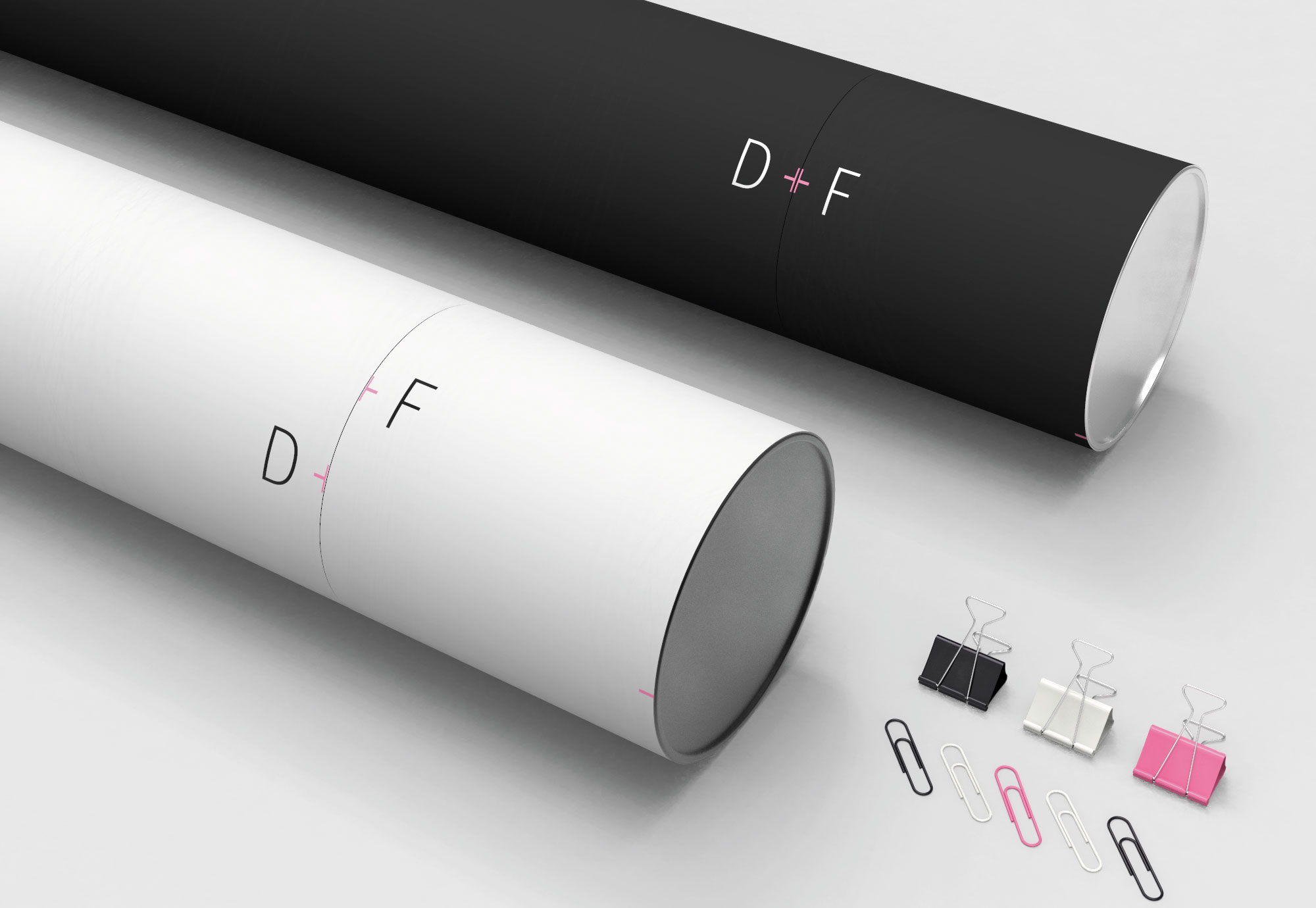
+ open project detailsThe approach in creating graphical language came from a simple idea of pointing out clear and the most noteworthy part of the brand name — plus sign. Making it pink what can be thought to be too tender for a solid architect group makes an identity show up against competitors and yet the right color management does not make it be felt too soft or unprofessional.
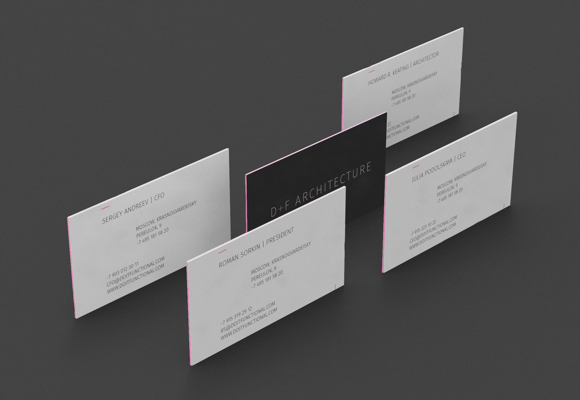
The style is minimalistic and remarkable. We managed to reach (as we suppose) maximum impact with minimal efforts. Some small elements make the identity recognizable even without a logo seen — note pink plus signs in the phone numbers.
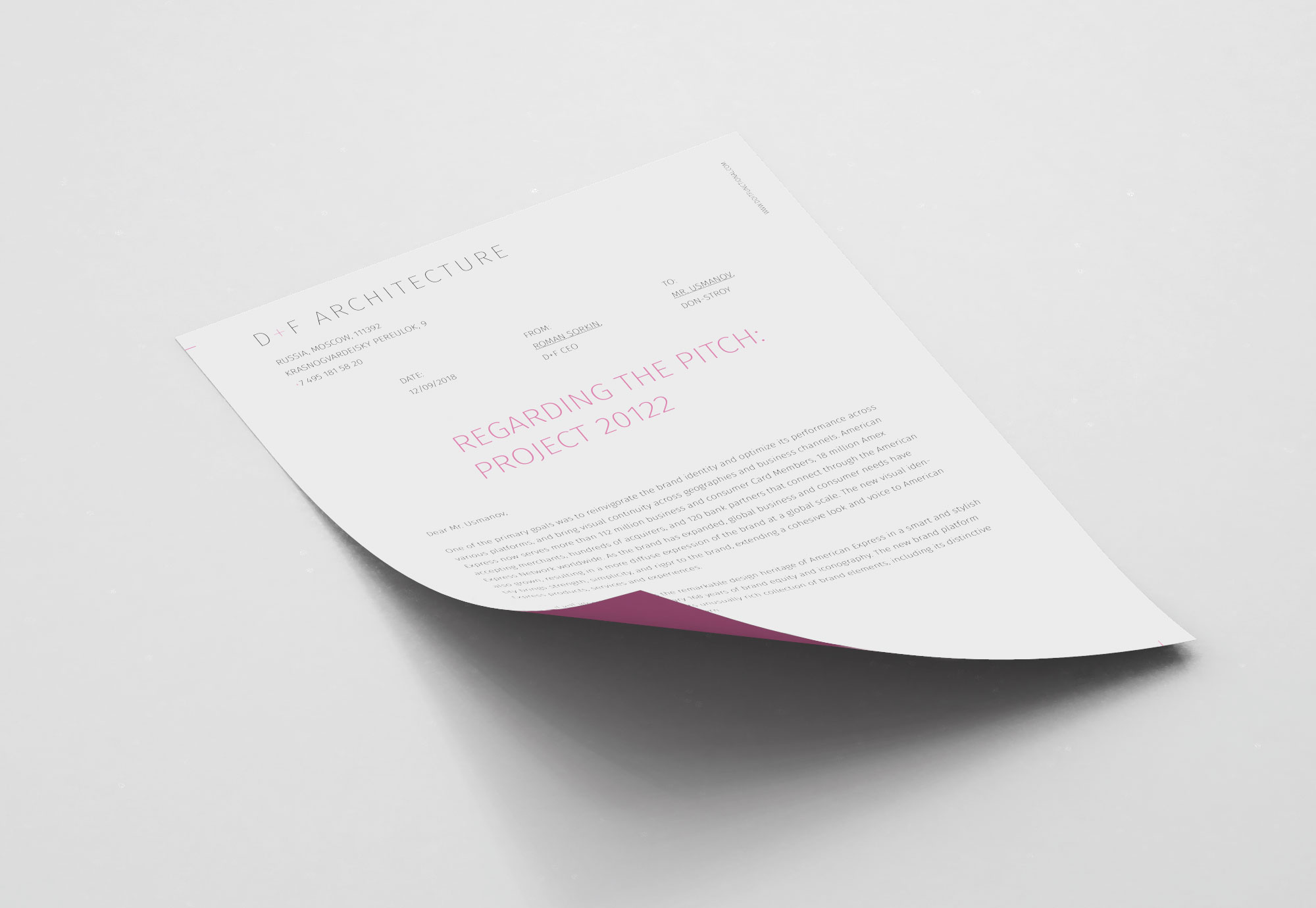
After the project completion, we also have been hired to create the website and company book.
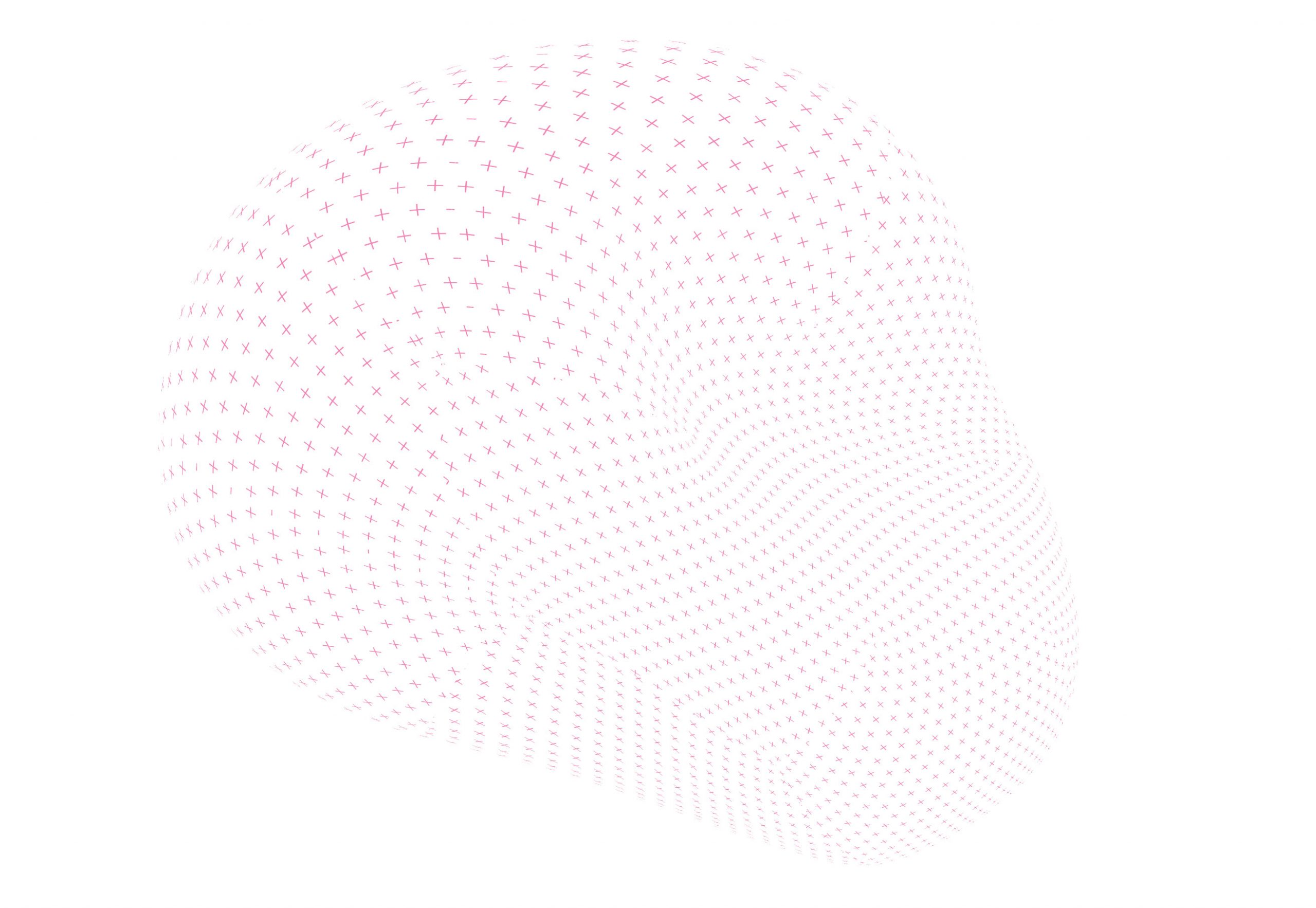
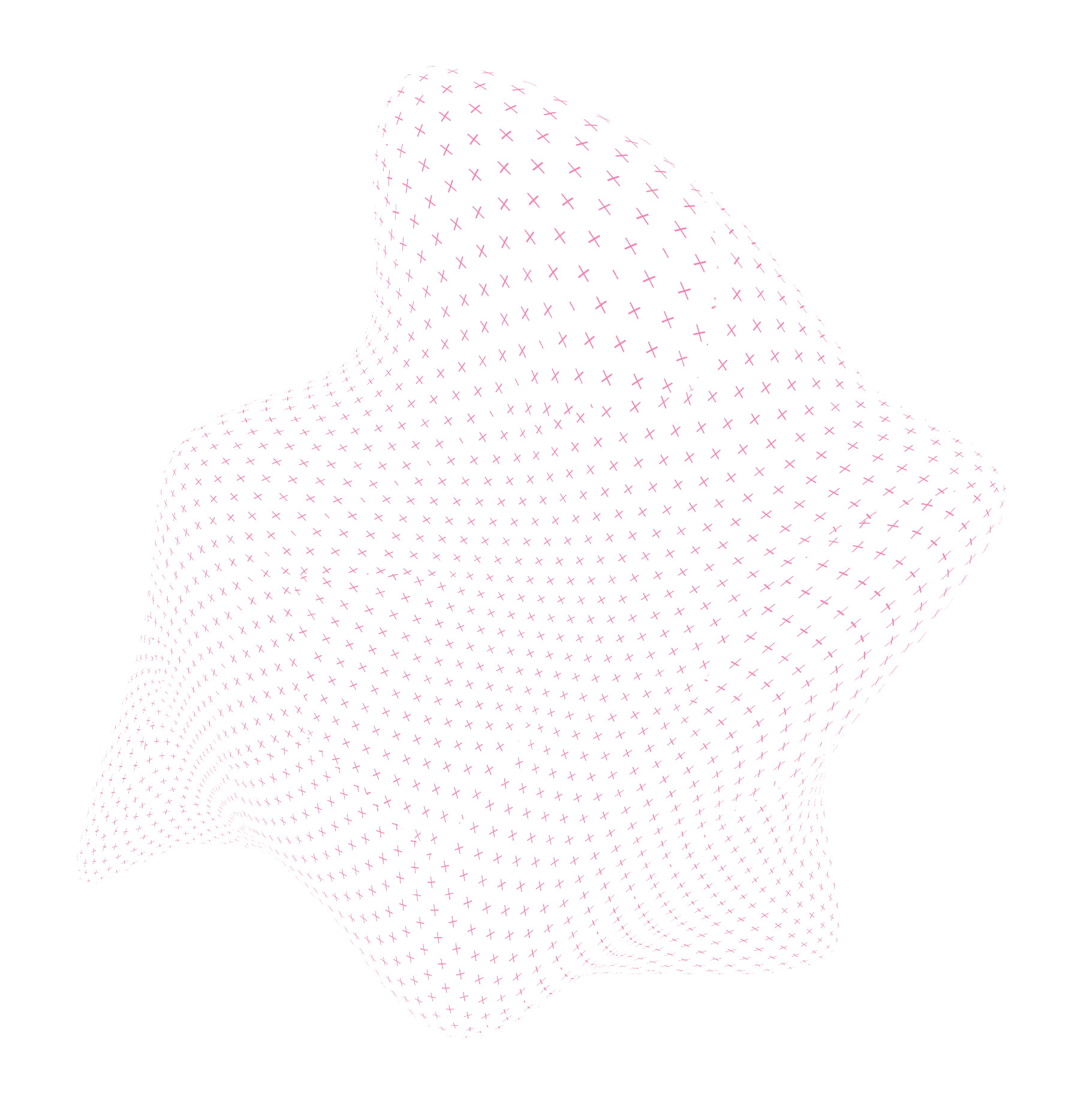
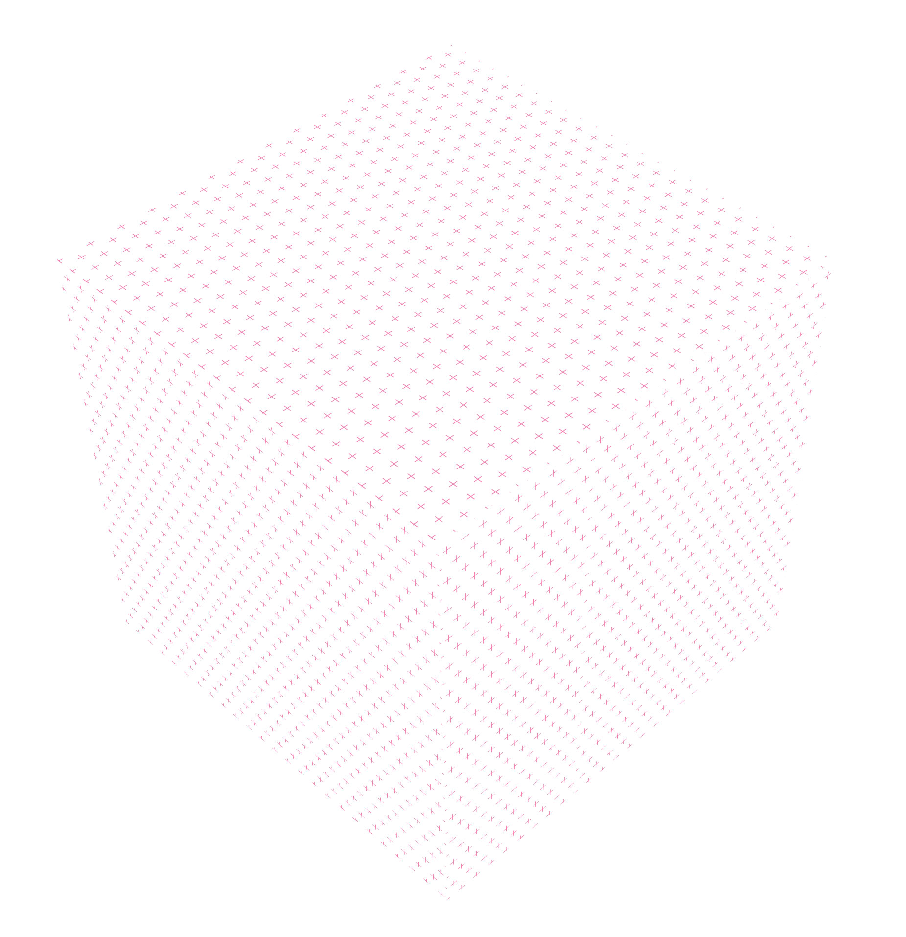
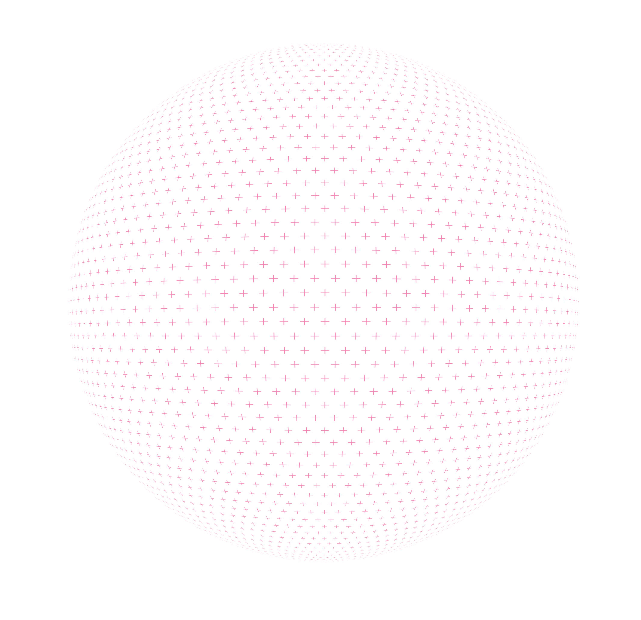
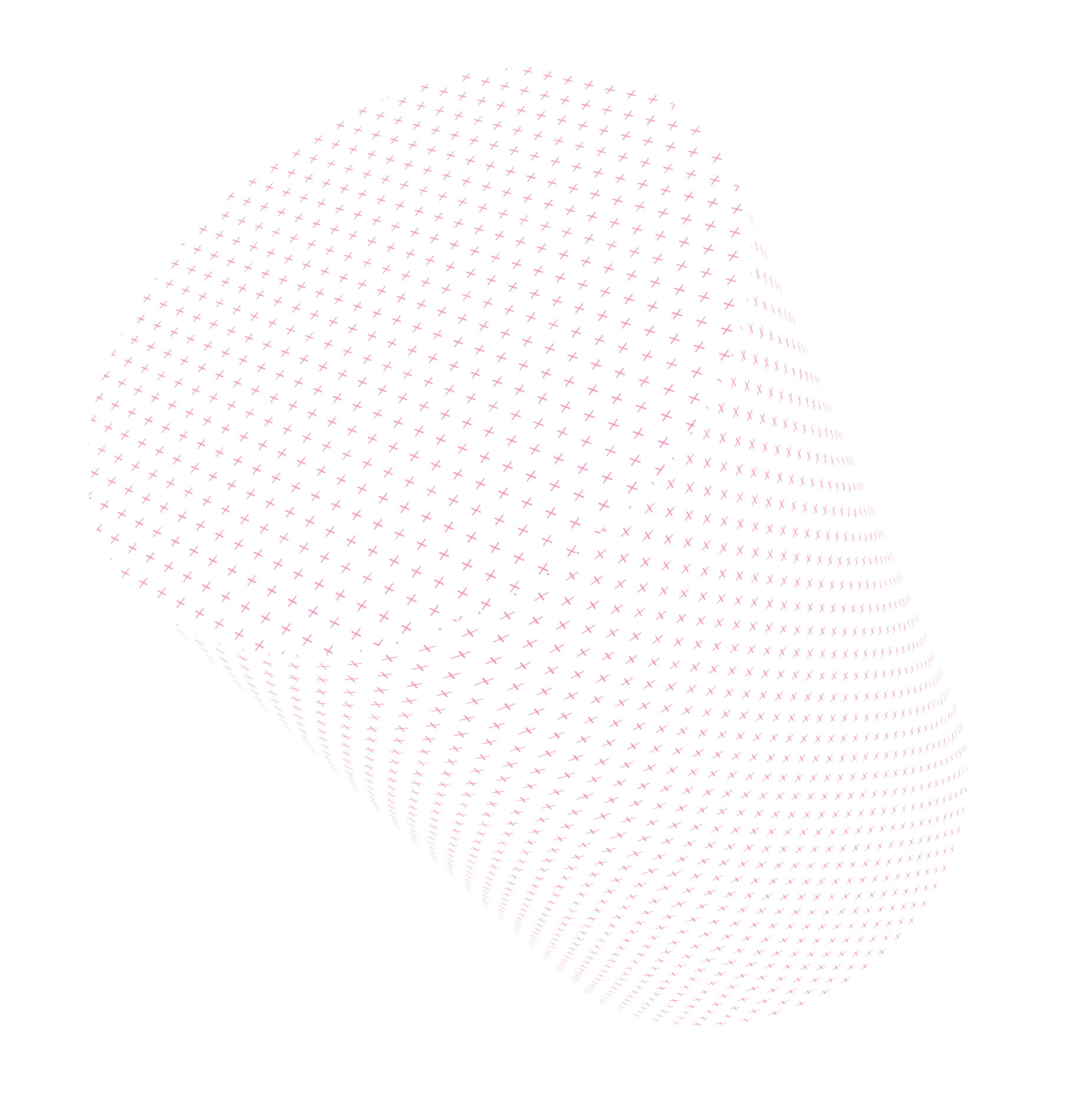
Additionally, we have generated different abstract forms using plus patterns on the surface. These forms would be used for different promotional purposes.