

Branding for the Wedgwood Institute, the building that stands in Queen Street, Staffordshire, England.
+ open project detailsThe Wedgwood Institute is a large red-brick building that stands in Queen Street, Staffordshire, England. It is sometimes called the Wedgwood Memorial Institute. Starting from 2009 it has been used as an exhibition center, so in order to communicate with the clients and visitors in a proper way, we have developed both identity and navigation systems.
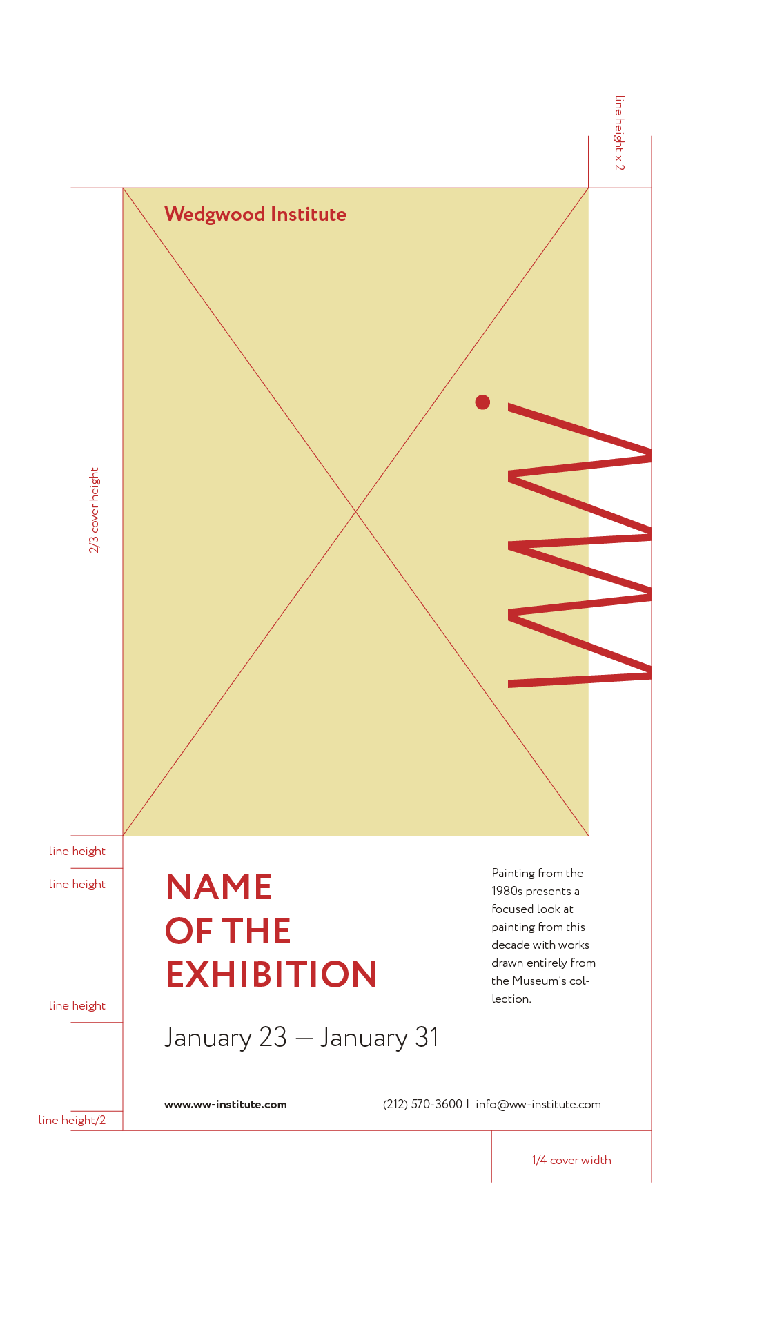
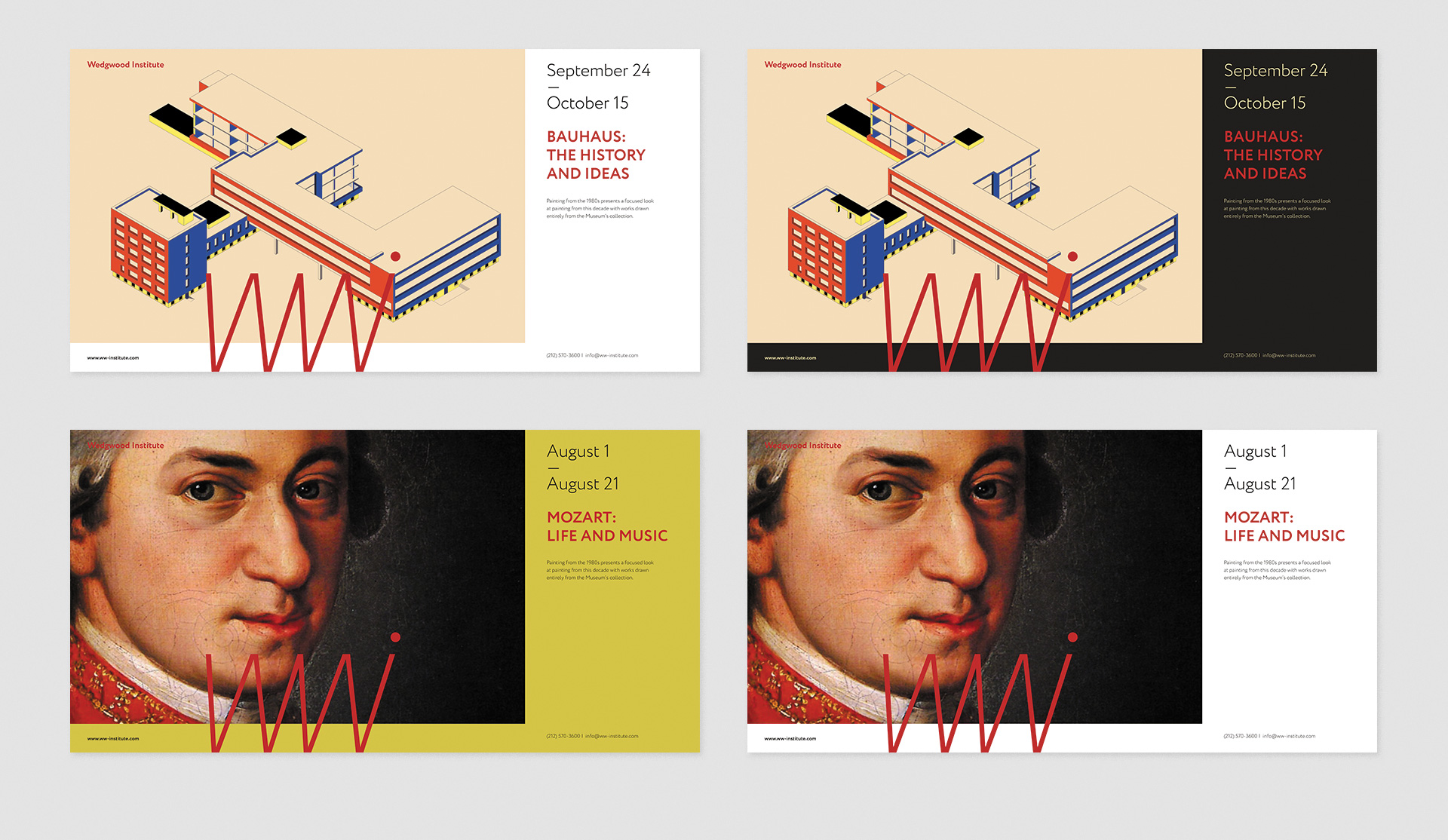
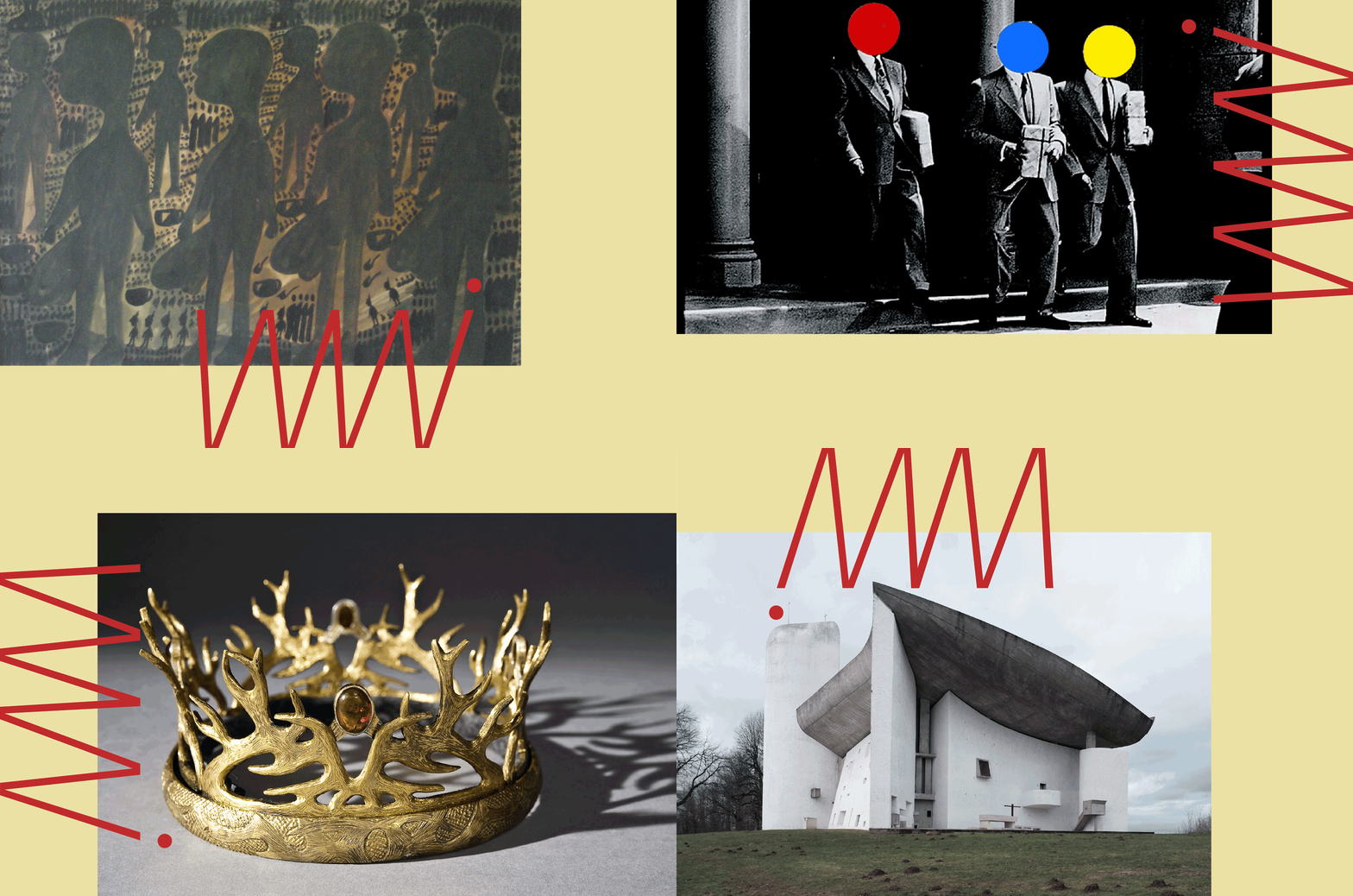
The main idea of the whole identity system is in using the logotype together with the hero of the exhibition or an event. It is done by chopping the logotype in a special manner so it appears out of the canvas bounds and hangs above both backgrounds and named above hero. This way of using the logotype allows us to brand any piece of design or advertisement in a recognizable and simple way.
We have tried to create a simple graphical language that would allow creating a vast amount of layouts in a matter of minutes and still stay recognizable and elegant. The project included working on identity system, wayfinding, print and marketing products.
Main idea of the whole identity system is in using the logotype together with the hero of the exhibition or an event. It is done by chopping the logotype in a special manner so it appears out of the canvas bounds and hangs above both background and named above hero. This way of using the logotype allows us to brand any piece of design or advertisement in a recognizable and simple way.
Every layout of any size that can be used by the museum is described in details so the system is consistent and working together with WWI and not against.
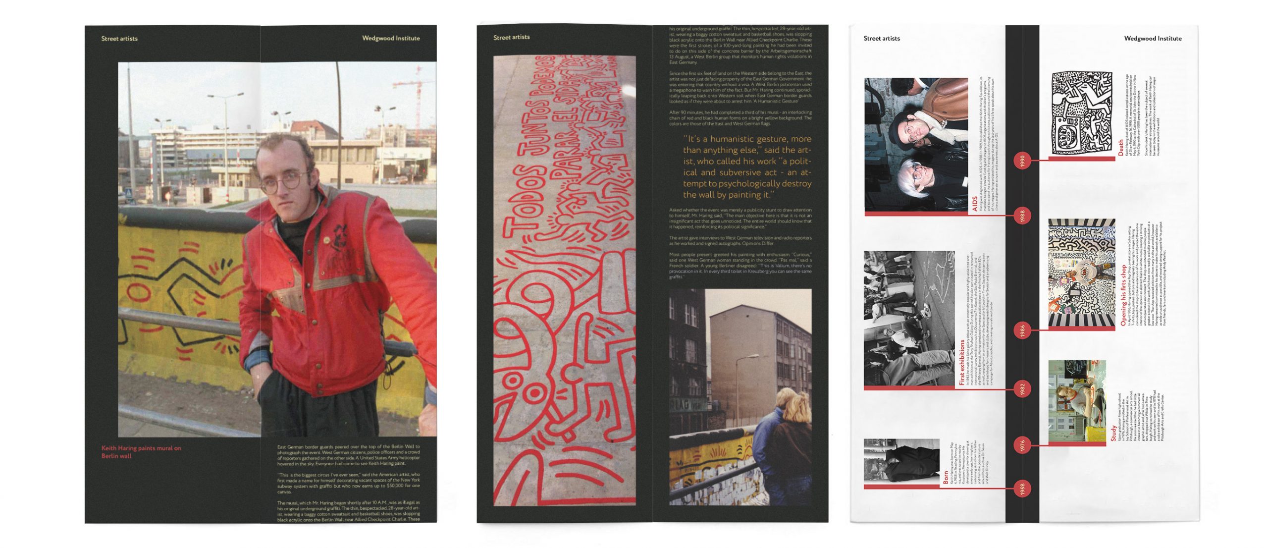
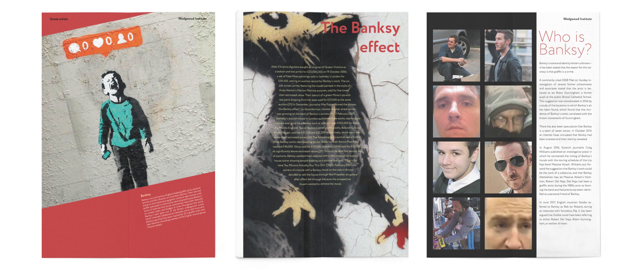
Creating this identity system we have developed some print production: programs and booklets for different exhibitions and events. Though they follow basic rules of the graphical system every spread is creative and differs what makes reading really joyful process. WWI colors allow gaining amazing graphical diversity.
More than 50 icons were created. Each can be understood without an additional description of what makes the navigation process inside the museum smooth and fast. Moreover to follow the brand system every icon is created on the base of a common grid made out of the logotype.
The wayfinding and navigation systems for the Institute are simple, clear but still created within the basic brand identity, which is gained by colors, straight corners and chopping the icons on the signs.
For every type of zone and every type of sign, we have developed a list of defined and clear rules in order to make the system as sustainable as possible. Here you can see the documentation and wayfinding system for Wedgwood Institute.


