

Brand identity for Integra Profex — energy corporation with offices in Russia and Europe. The company is manufacturing breakthrough technology of real-time condenser cleaning and enhanced heat transfer.
+ open project detailsOur mission was to create a clean, bright and humanistic identity that would help to stand out and support marketing tasks. The sign origination comes from the form of turbine cleaning grids and RCCS forms (main company product). Two parts create the letter «I» inside. Color change symbolizes the cleaning process.
Logotype form and concept become a strong basis for the company graphic language. First of all, these are company icons. All clean and fun, yet functional and easy to understand. Moreover, a custom typeface named Integra Pro based on Cooper Hewitt has been developed by our team, so any layout becomes easily branded.
We believe the graphical language developed by our team (in our humble opinion) is humanistic and remarkable and has the ability to touch potential customers though it does not create a sense of something not very serious.
The brand DNA is flexible and remarkable. It allows us and the customer to create a vast amount of bright and functional layouts.
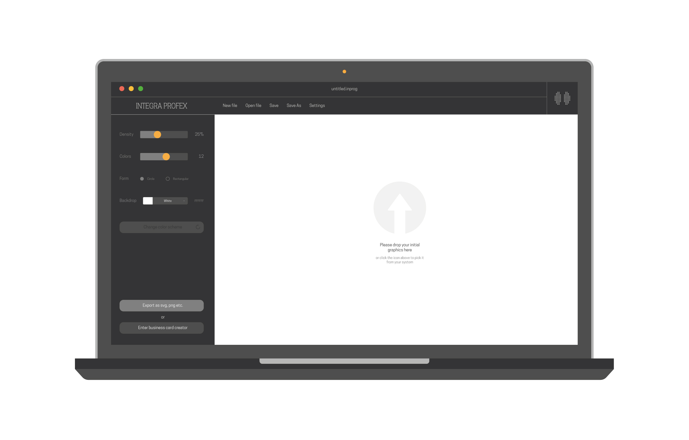
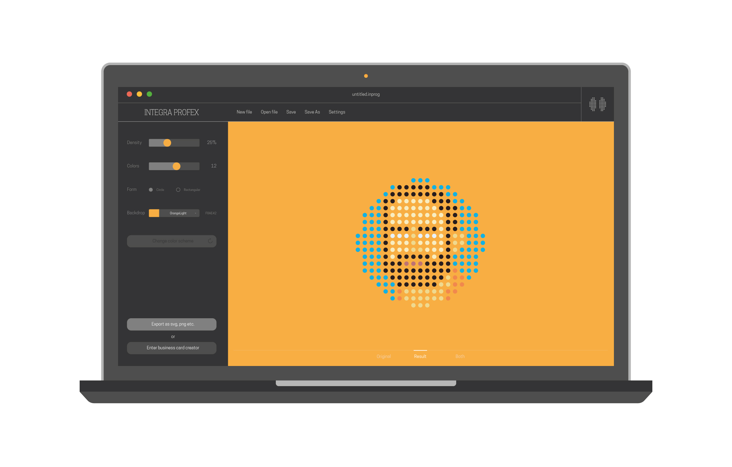
As it can be hard for the customer to create the icons manually, we have created special software that helps to create the brand DNA elements. It is easily installed on the customer computer so any person can use it.
The created identity system is described in detail in the language manual. Every aspect of the brand is described in the document. Moreover, we keep on working with our customer to support them in following created guidelines.

