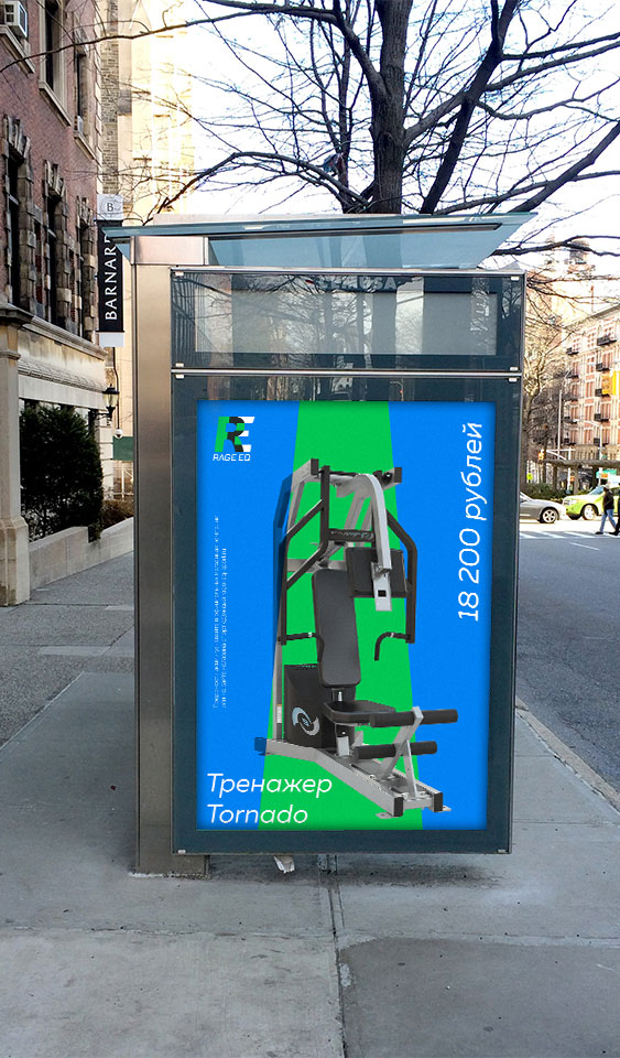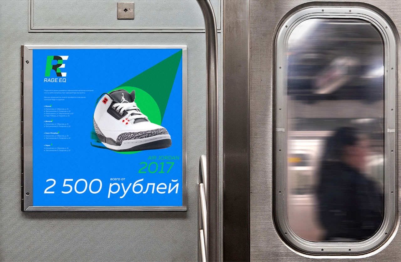


Naming, brand development and print design for sports equipment stores in Russia.
+ open project detailsRage Eq (short from Equipment) is a new chain of sports stores in Russian regions. We were tasked with developing a brand and visual language of the company that would be completely different from competitors and express the dynamic and modern spirit of the project.
Initially, the task was to develop a simple and memorable sign, at the same time containing movement and elements on which a recognizable corporate identity of the company can be built. The solution was to combine the letters R and E into one symbol, while the slope of the letters gives it dynamics, and also allows you to build interesting graphic elements on branded media.
The mark has been developed into a graphic language that fully reflects the company’s active yet disciplined approach to doing business.
In addition, we developed a branded booklet-catalog of the company, the task of which was to convey the plans of the organization, as well as to demonstrate the main equipment being sold.
For the company, we also developed a detailed brand book that tells about the rules for working with corporate identity elements.

