

Rebranding for the electrotechnical company Elis Group based in Russia.
+ open project detailsIn 2016 we were commissioned to completely rebrand a large electrotechnical company. Elis Group is a Russian company delivering their customers a large amount of different electrical equipment: cables, transformers, and couplings. The company existed for more than 5 years and their branding was quite poor and cowardice.
We have developed a brand new graphical language that is both disciplined and playful reflecting both reliability and creativity in solving the most difficult client issues. The brand is also now bright and is filled with positivity.
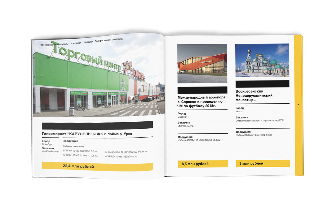
We have developed a large number of different materials within the project including all promo layouts, presentations, and a large corporate booklet. We have received great positive feedback from the customer as the new brand and face of the company helped Elis Group to communicate with their client on an absolutely new level.
The logo is a combination of letters E and G created on the grid base.
A company sign is bright, remarkable and easily reproduced and recognized.
Besides Helvetica used as a company font based on the same grid as a logotype, we have developed and programmed the Elis Font. Elis font is used as a display and lets the customer identify the company from any point and even without seeing a logo and organization name. The combination of gray and yellow colors was chosen based on competitors’ color palettes and the idea of light coming out of the dark. Dark equal competitors. Light equals Elis Group.
We have also developed a beautiful and informative company booklet.
We have also added some beautiful infographics to the booklet.
The graphical system is described in detail in the company brandbook.

