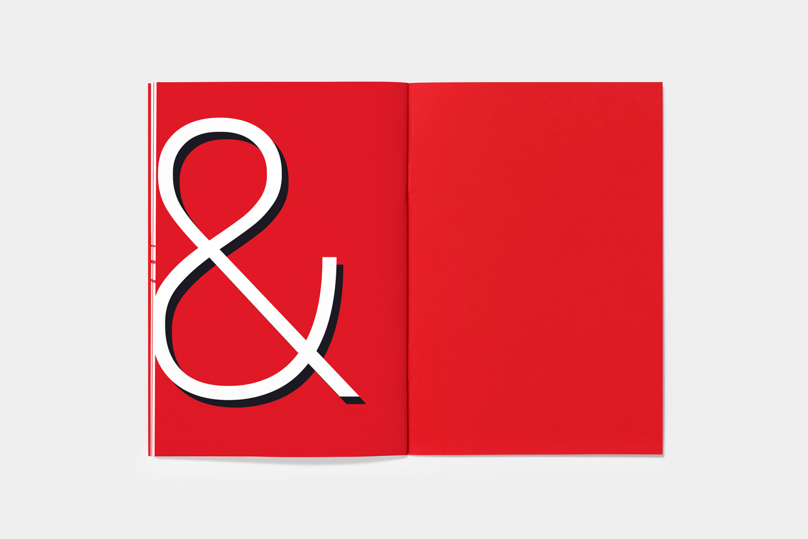


Booklet for the consulting company Sendler&Company headquartered in Berlin, Germany.
+ open project detailsSendler&Company is an international consulting company headquartered in Berlin. The company provides consulting, general contracting, construction design and other services. In 2019, our team carried out large-scale work to develop the Sendler&Company brand, which reflects both creativity and dynamism, as well as discipline and maximum control in work.
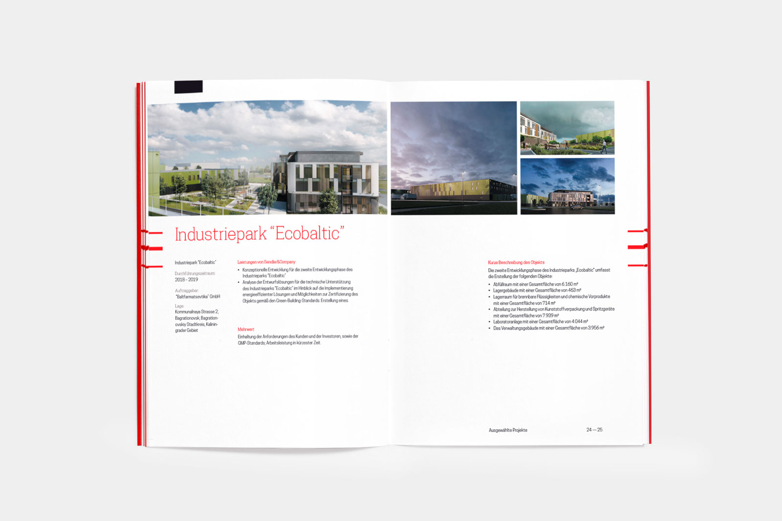
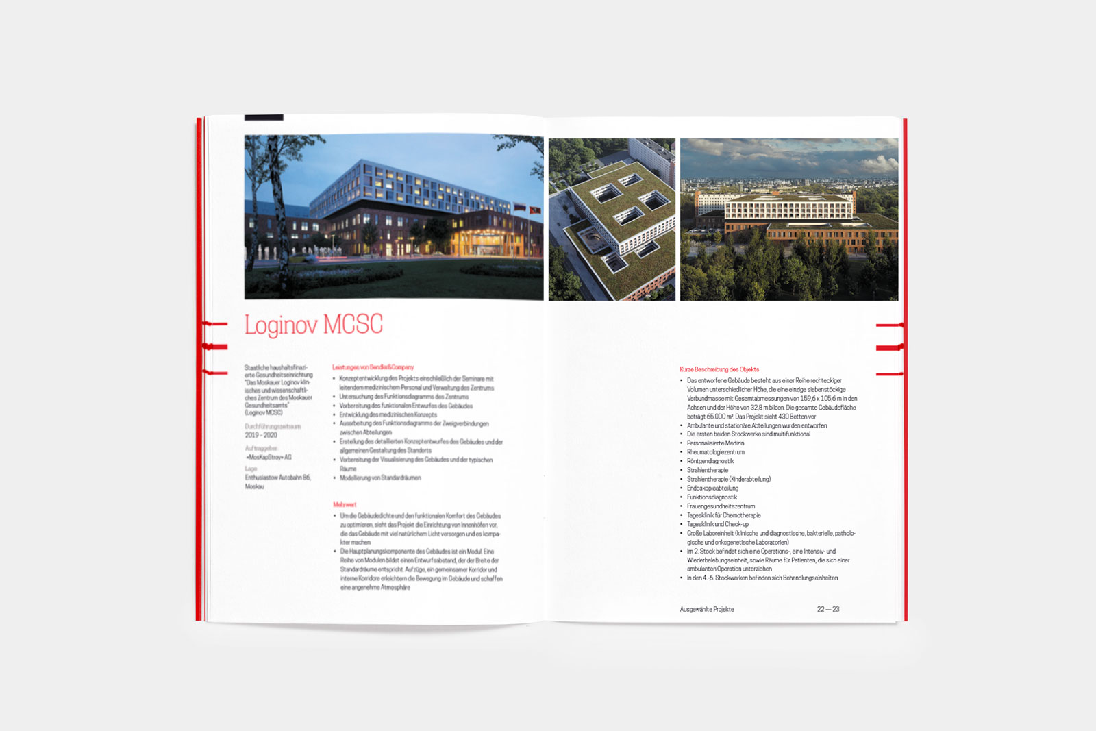
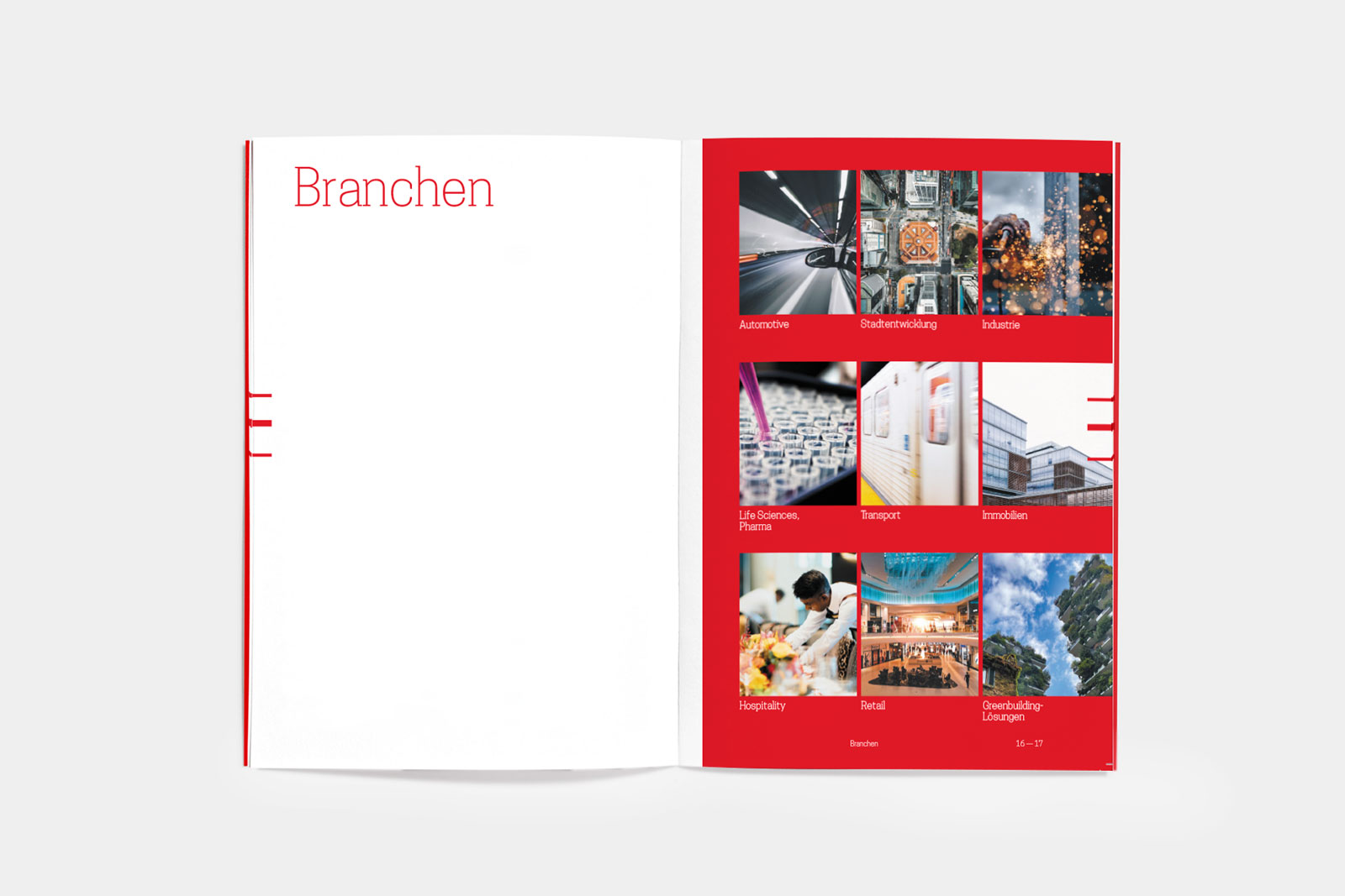
As part of this work, we also completed the design, layout and preparation for printing of the company’s booklet, which tells about the competencies, completed projects, workload, offices and numbers. The booklet is at the same time strict and bright, attracting attention, but doing it unobtrusively foreign language.
Many of the client’s values coincide with the positions of our team’s manifesto, which always makes working on any Sendler&Company tasks a pleasant and synergistic process. We have been working with the company for more than 4 years, having completed a large number of various tasks.
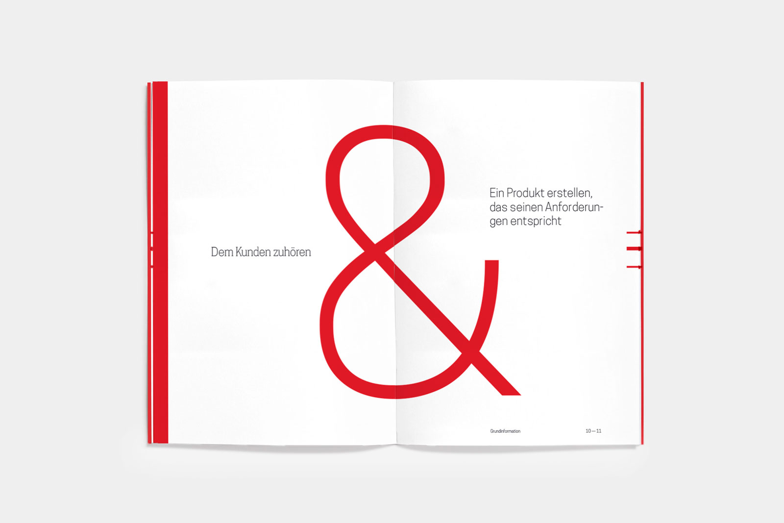
The name of the company is “spaced” on the front and back of the booklet, and the symbol “&” is located at the junction of these elements. Red lines are printed around the edges of each page of the booklet exactly where the “&” symbol appears on the cover. This creates a sense of volume, and also visually creates an image of the creativity and openness of the company.
The booklet elegantly but colorfully reveals data about the company, its values, competencies and projects. We tried to make each booklet dynamic, but at the same time businesslike and strict.
The “&” symbol plays a crucial role in the company identity we have developed. Likewise in the booklet, the “&” symbol is played both for the formation of information spreads and as a decorative element, creating the necessary image of Sendler&Company in the perception of those who get acquainted with the booklet.


