

Branding and identity for pharmaceutical corporation in Scotland. The playful yet disciplined brand to reflect both responsibility and creativity.
+ open project detailsMedian is a medicine corporation from Scotland. The company has it’s own medicine shops and labs. Our task was to develop the brand identity system that could stand out in a positive way, avoid any obvious solutions, be provocative, remarkable and simple. We managed to create a flexible and yet recognizable system that does make you look. Moreover, the brand is truthful and does not lie while advertising.
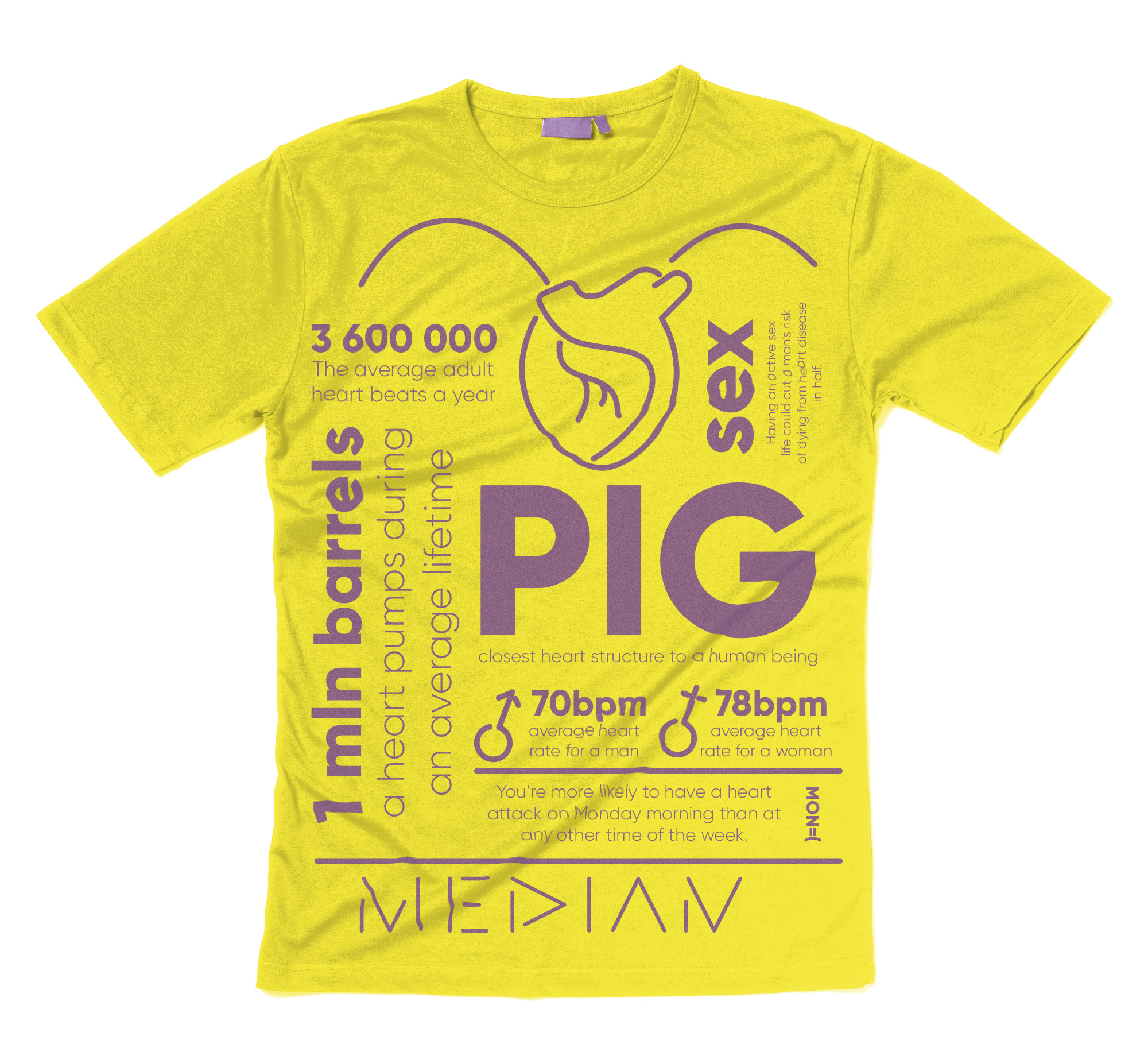
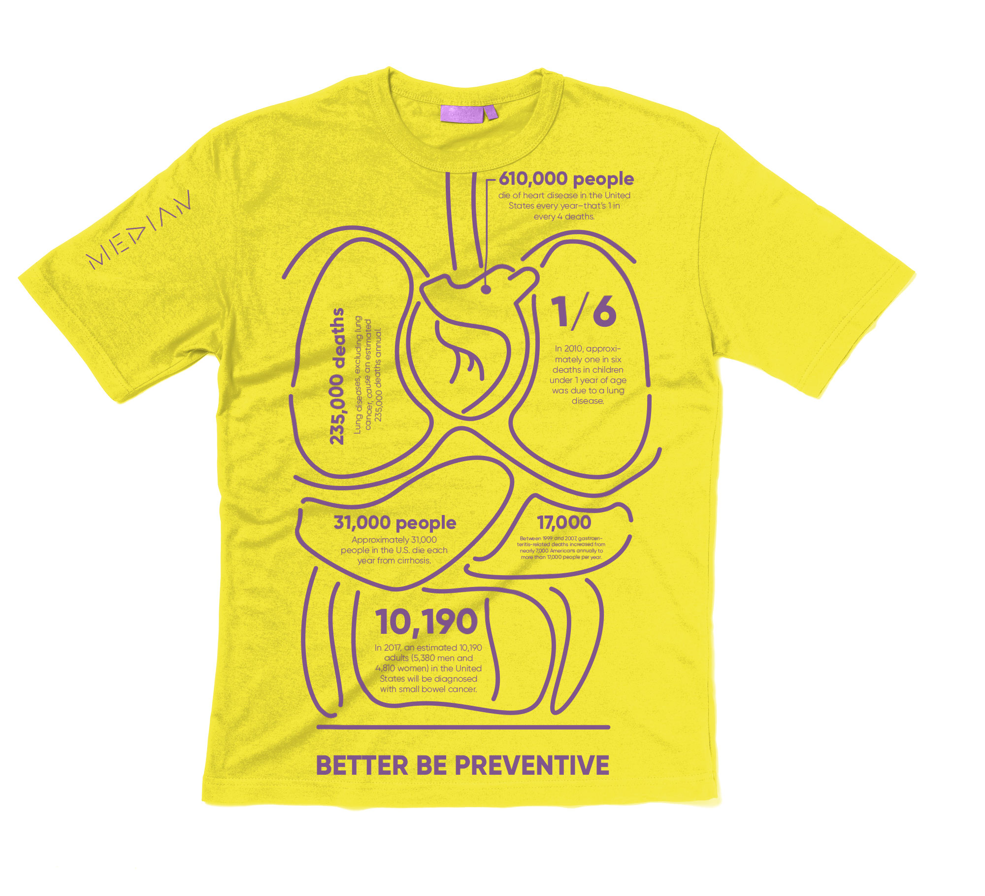
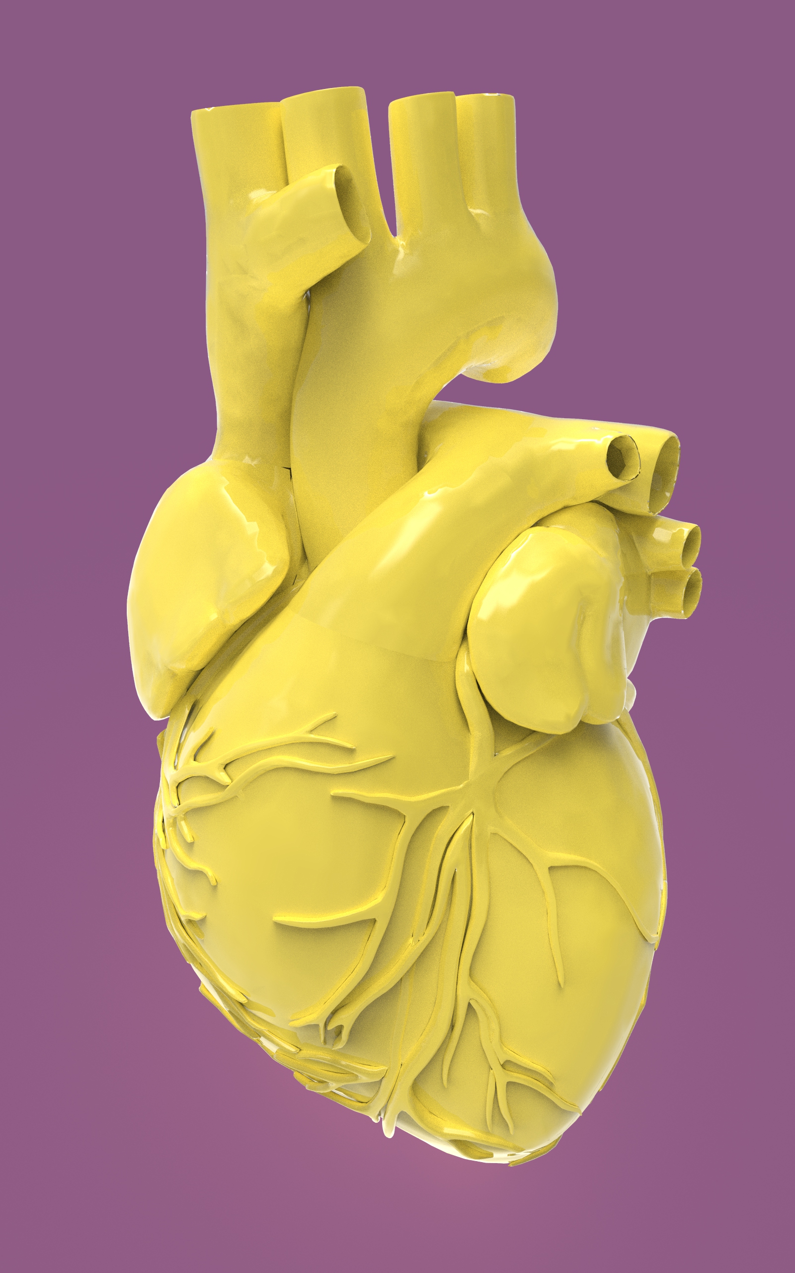
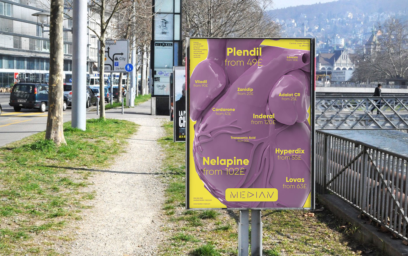
The logotype is created based on the possibility to use some simple forms for each name letter. Remarkable shapes with rounded corners are associated with pill forms and become brand DNA that can be developed in different ways shown next. Another crucial DNA element is the color system. No green or blue usually used in medicine corporations’ identities were applied. Bright yellow and purple are technological and remarkable, make you feel positive and associate the brand.
We have managed to create a playful brand that allows communicating serious topics.
The stationery and documentation look bright yet clean and clear.
Besides basic stationery, we have developed a large number of souvenirs and promotion products. Below you can see the special case with the USB and company booklet. The booklet tells about Median and provides some interesting medical information.
Company graphic language was also applied to digital resources.


