

Branding for young architecture company working in Russia and Israel.
+ open project detailsIn 2016 we were commissioned to create a graphical identity and web site that would help the customer to tell about their capabilities, ideas, and projects. Malinovich Arhitects has offices with clients in Russia and Israel and working with clients all over the world.
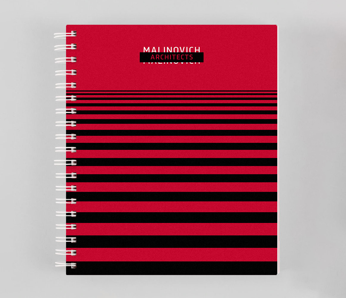
We have been working on the project in 2016–2017. A simple sign, black and red colors and straight rectangular forms are simple and effective brand DNA elements supporting in sending their potential and existing clients the right message.
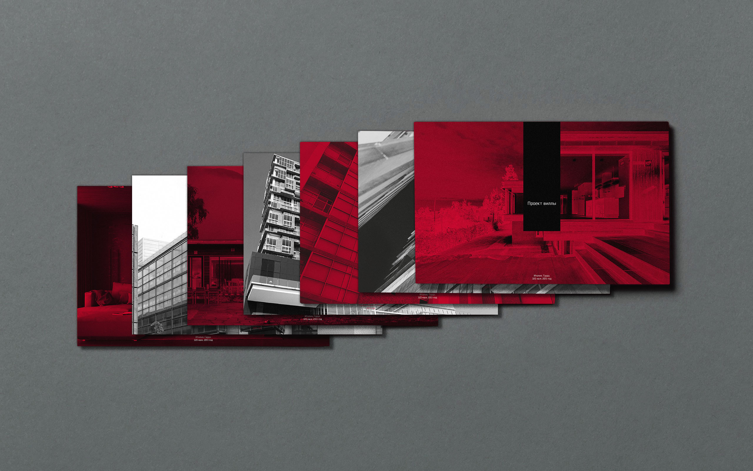
Working on this project we developed also the way of turning any photo of the project into a branded element by adding black and red gradient, which are 2 main brand colors.
By applying gradient map to any photo, we easily turn it into a piece of identifiable graphical language.
The brand is explained in detail in the graphical manual developed by our team.

