Weinbrenner Holding is one of Germany’s largest organisation providing senior care in it’s different forms. The holding provides a wide range of services – insurance, medical care, consultations, and most importantly – the holding has its own nursing homes, where professional medical workers take care of the older generation.
Weinbrenner hired us with a global goal to develop a new graphic language, a new face – more modern, but at the same time retaining a sense of tradition in its identity.
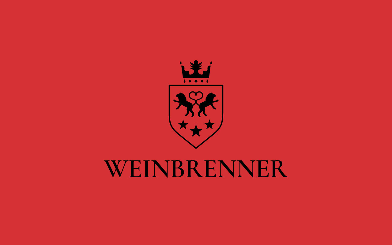
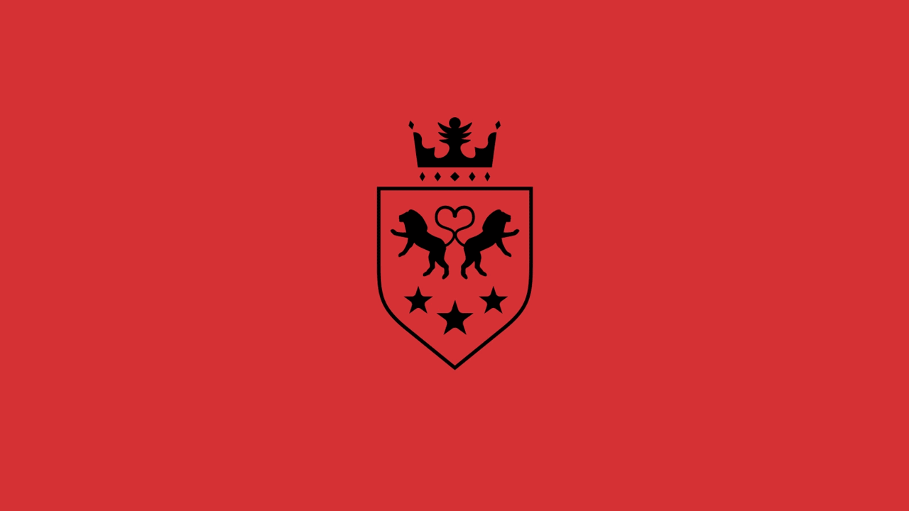
One of the main goals of the project was also to ensure a certain continuity from the old sign of the organization, which we did by preserving the overall composition. We have retained the form of the coat of arms, as well as the three main elements – lions, crown and stars, as symbols of care, quality and tradition.
We have completely redesigned all the graphics. An additional important element of the graphic language is the crosshair of the lions’ tails – in it you can see the shape of a heart, which symbolizes love and care.
At the moment, the new identity is in the process of integration and implementation.
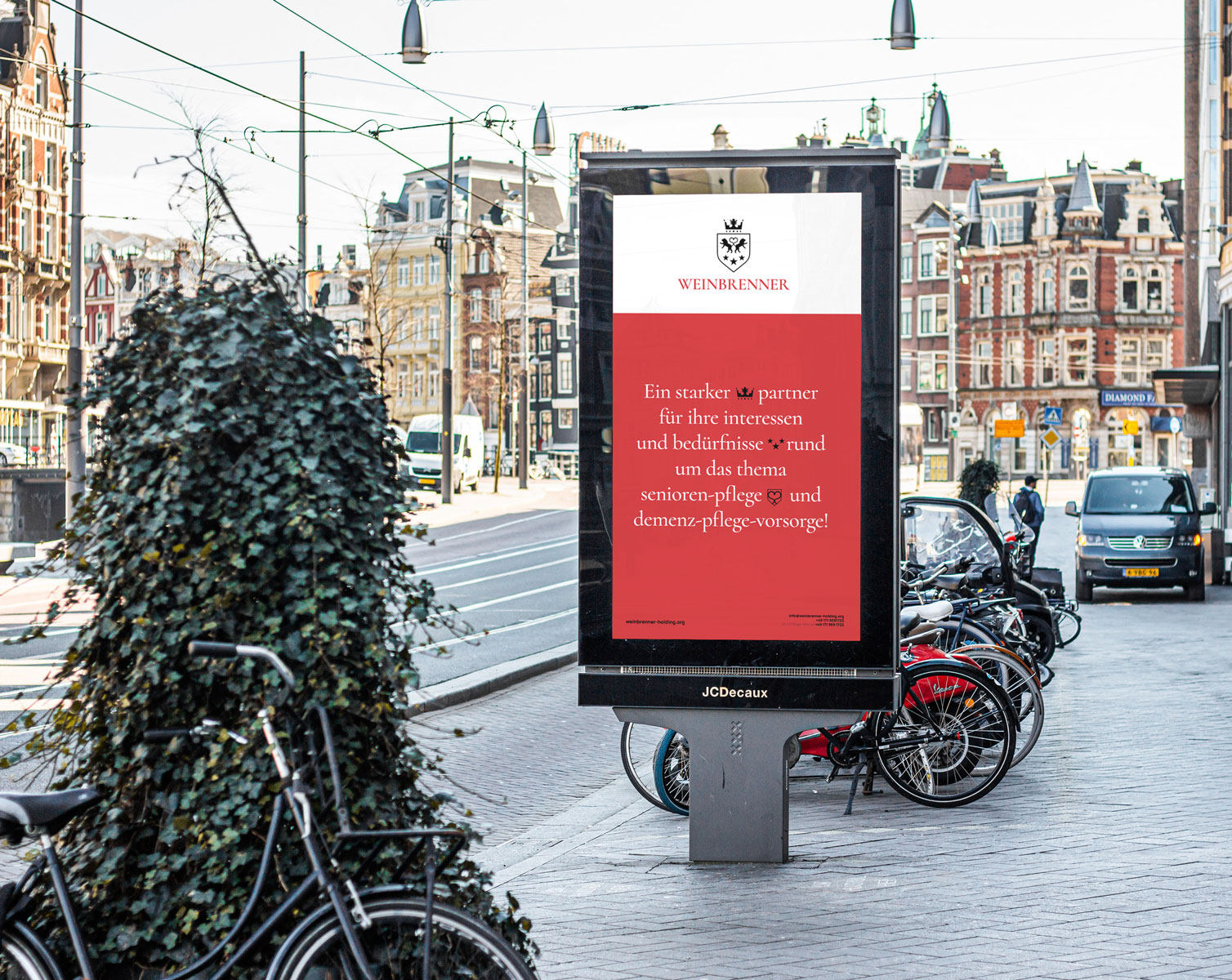
We continue to work on other tasks of the company, including website development, as well as various promotional and marketing materials.