

Design, layouts and production control for the energy corporation for Chinese market.
+ open project detailsSMK provides supplies and services in the energy sector. The company operates both in Russian and foreign markets. Previously, our team developed the SMK identity, and now we were tasked with creating a bright and interesting booklet for Chinese customers.
For us, this is not the first experience for clients from China, and we were extremely pleased to once again encounter such an interesting graphic language.
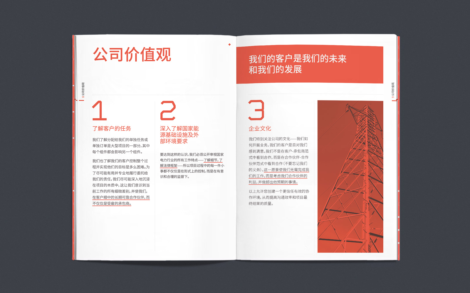
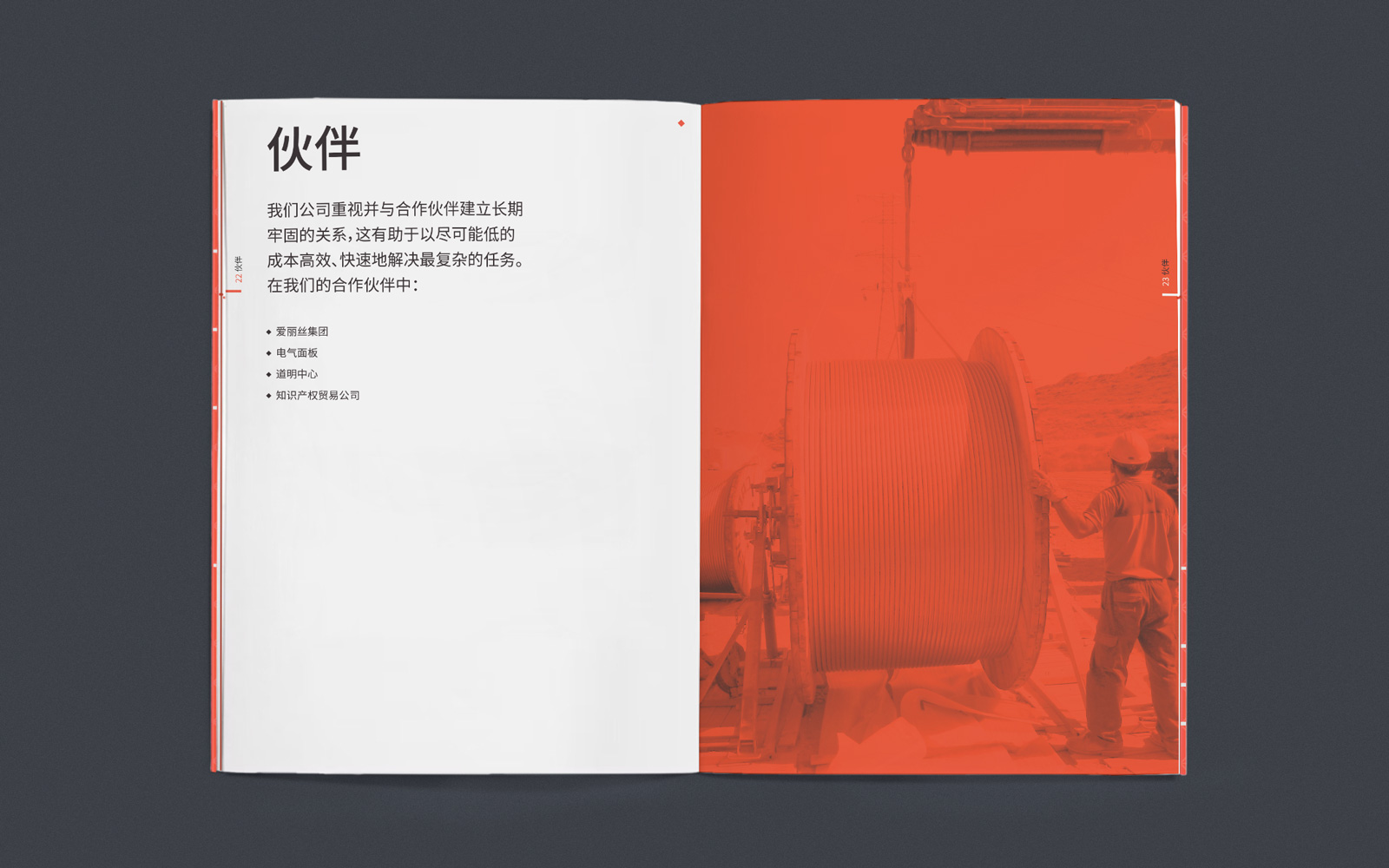
The task was, without deviating from the basics of the company’s identity, to make a bright booklet that differs from the competitors. We carried out this task in every detail – starting from the red staples on which the booklet is assembled, ending with the smallest elements, like page headers. As a result, we got a truly rich product filled with colorful graphics and informatively telling about the company’s products and competencies.
Booklet cover
One of the most interesting elements of the booklet is the unusual cover. The red paper is varnished, which forms the company’s signature pattern, and the company’s logo printed on a 3D printer is pasted on top of it. This cover helps the company to distinguish the product from the huge number of competitors’ offers and attracts attention very well.
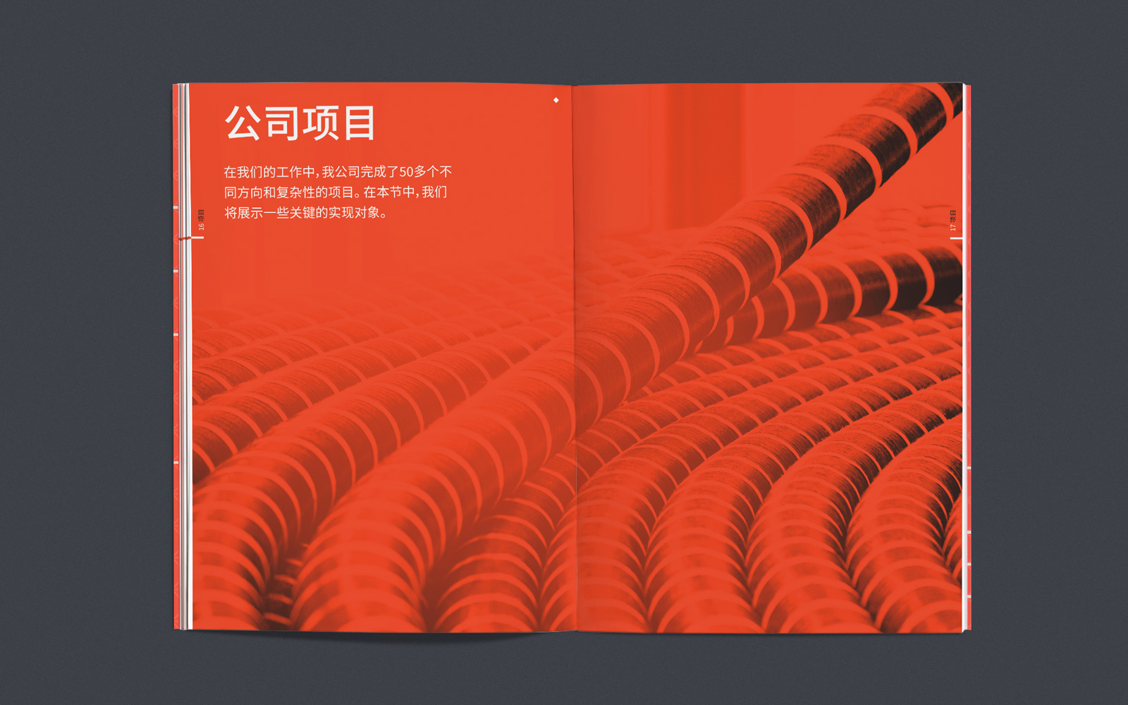
The inside units themselves are made according to the general structure, taking into account the style and corporate identity of the company. Photos are processed with a gradient map, all icons are drawn according to the general brand grid.
Our company is actively working with international clients, including the markets of the USA, Europe, China and India. Working with a new language and in a new country is always a challenge and an opportunity to see familiar tasks in a new way. When working with this booklet, we involved professional translators and specialists who helped us correctly compose the structure, text, and also understand the peculiarities of the perception of the customer from China.
The first and last spreads are linked by common graphics — it is important for us that all parts of the booklet merge into one consistent “story”, which always helps the end user of the booklet to perceive information.


