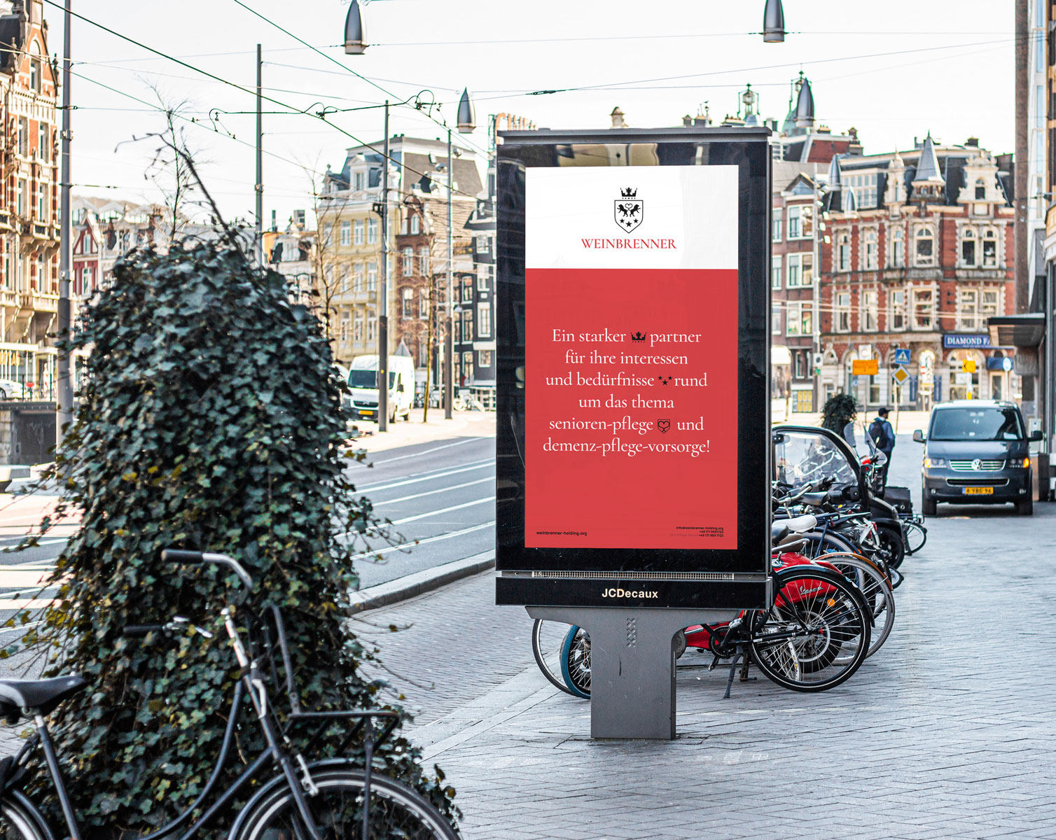
Weinbrenner Holding is one of Germany’s largest organisation providing senior care in it’s different forms. The holding provides a wide range of services – insurance, medical care, consultations, and most importantly – the holding has its own nursing homes, where professional medical workers take care of the older generation.
Weinbrenner hired us with a global goal to develop a new graphic language, a new face – more modern, but at the same time retaining a sense of tradition in its identity.
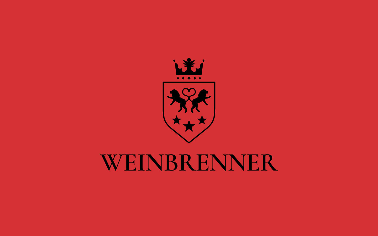
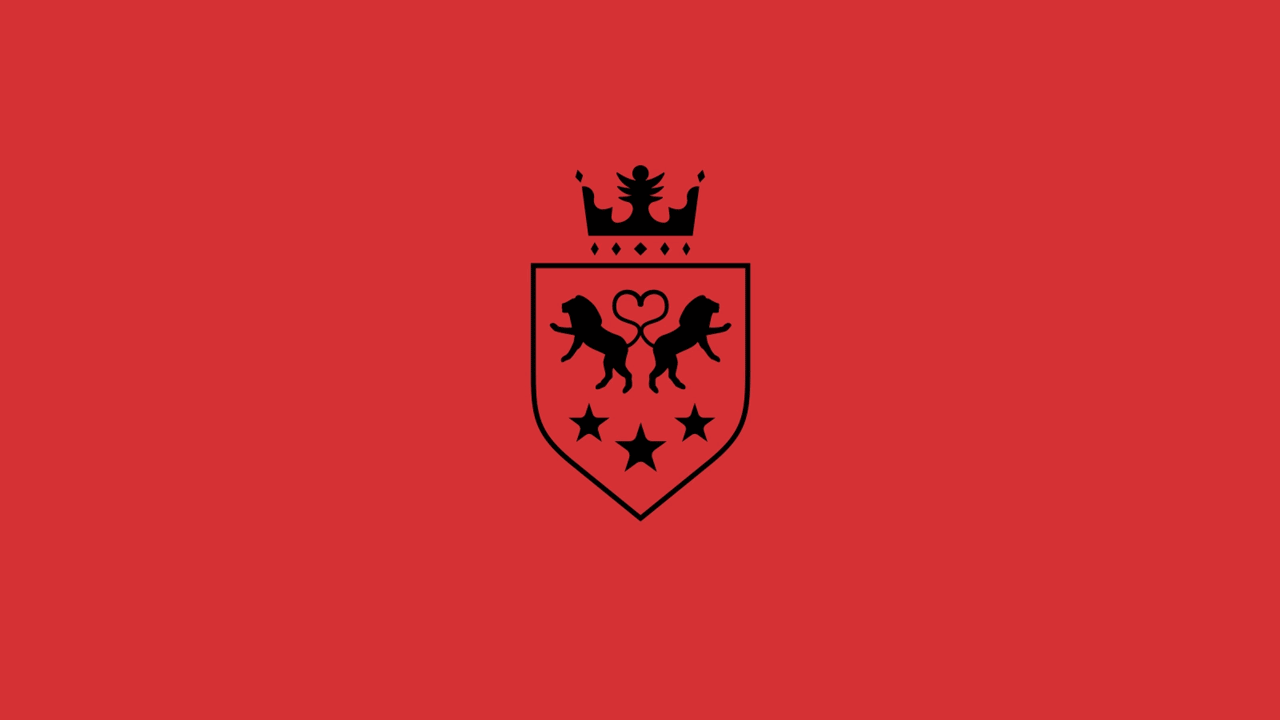
One of the main goals of the project was also to ensure a certain continuity from the old sign of the organization, which we did by preserving the overall composition. We have retained the form of the coat of arms, as well as the three main elements – lions, crown and stars, as symbols of care, quality and tradition.
We have completely redesigned all the graphics. An additional important element of the graphic language is the crosshair of the lions’ tails – in it you can see the shape of a heart, which symbolizes love and care.
We continue to work on other tasks of the company, including website development, as well as various promotional and marketing materials.
Our team has developed a bright, dynamic, and memorable identity for the Pharm Lavka delivery and booking pharmacy network. The company logo is a combination of the (Cyrillic) letters F and L in one symbol, which also forms a corporate hero.
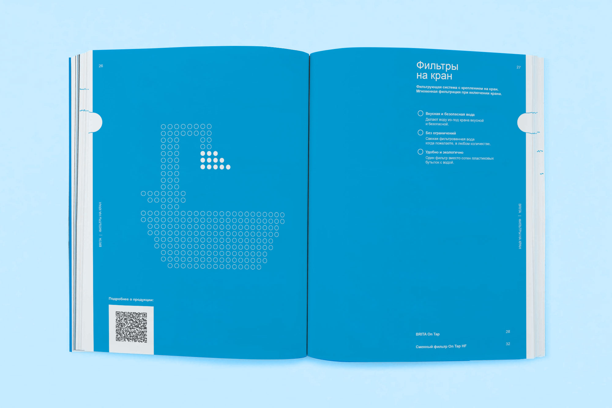
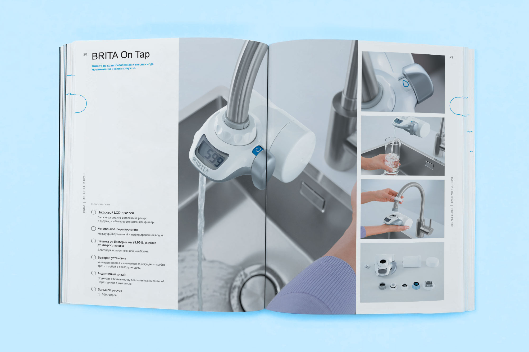
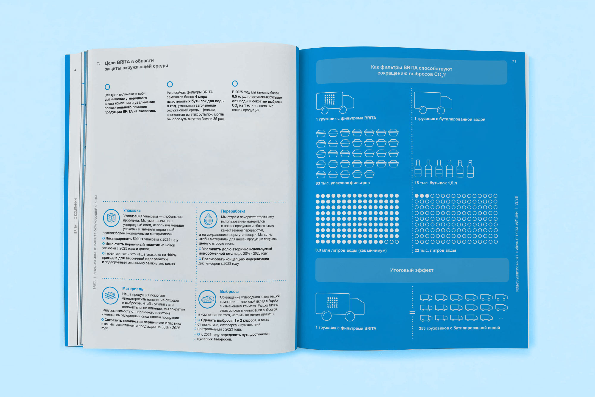
The logo clearly distinguishes the company from competitors, while remaining relevant to the client’s area. At the moment, a graphic language system is being introduced.BRITA is among the leading experts in the field of water optimization. The family business was founded in 1966. We are happy to announce that we have created a series of print products for BRITA, including a General Catalog on filtration systems.
The catalog includes information on different filtration systems, created for the Russian office. It took us one and a half months to complete the job. It was a great pleasure to work with the Client.
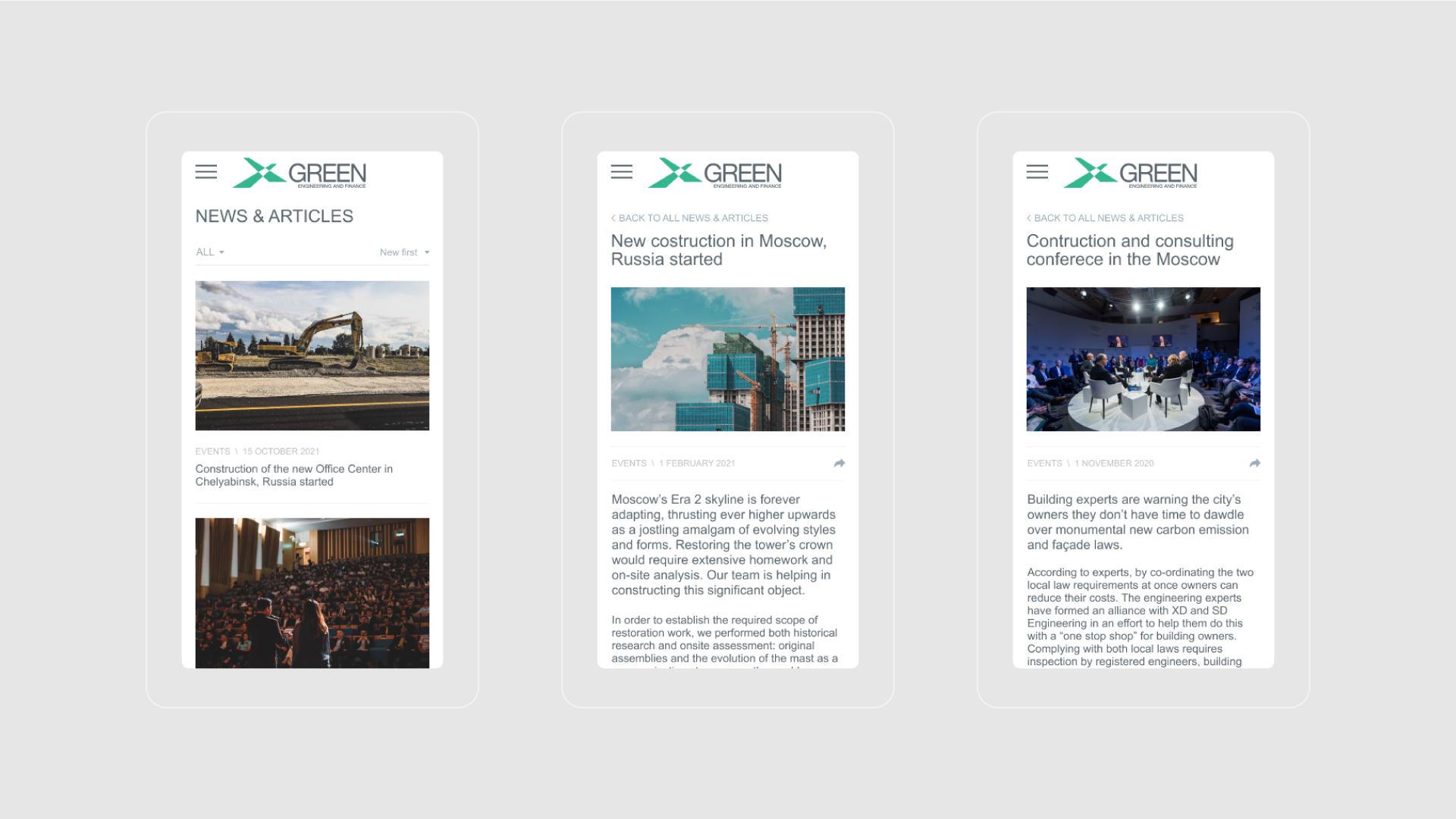
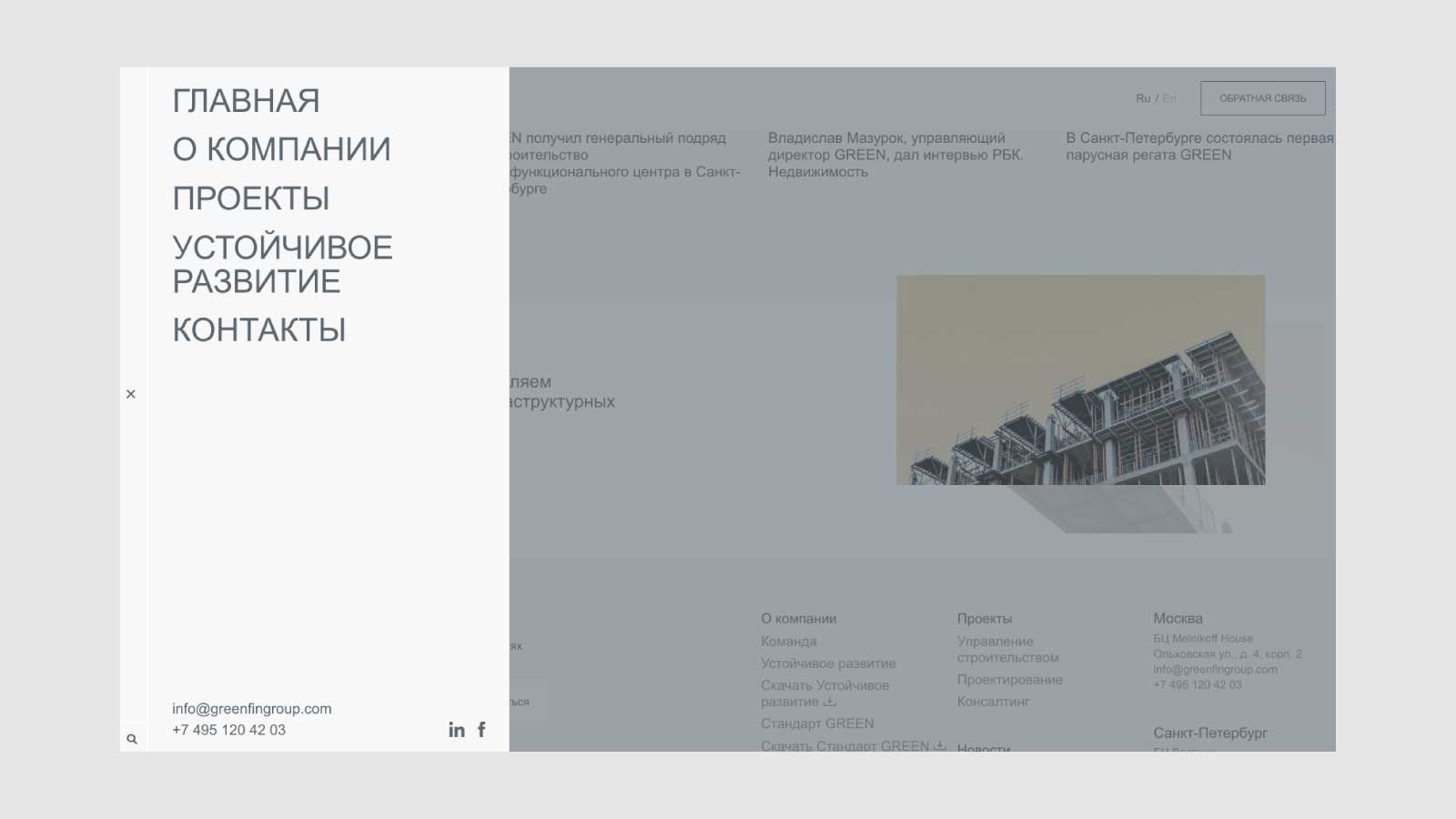
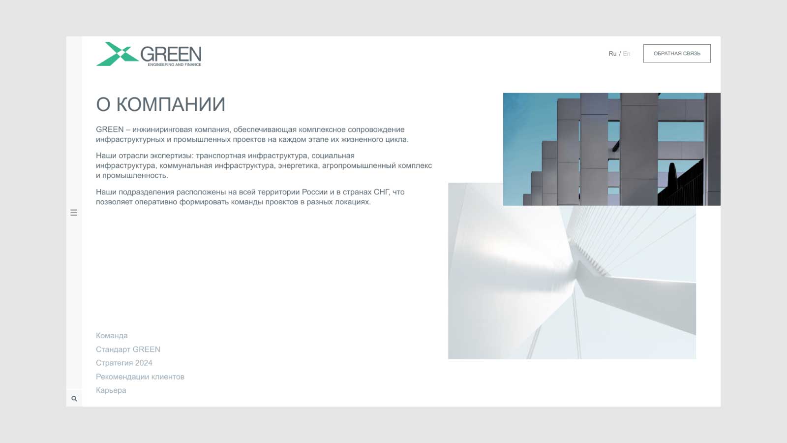
We have completed the website development for our client Green Egineering and Finance.
GREEN is an engineering company that offers complex support for infrastructure and production projects during every stage of their lifecycles. The industry profiles include transport infrastructure, social infrastructure, utility infrastructure, energy infrastructure, agro-industrial, and production and manufacturing.
Our team has created the concept and layouts in Figma and after developed the website. You can see it online here. This is the second project we have worked on with Green after we have completed the identity development in 2020.
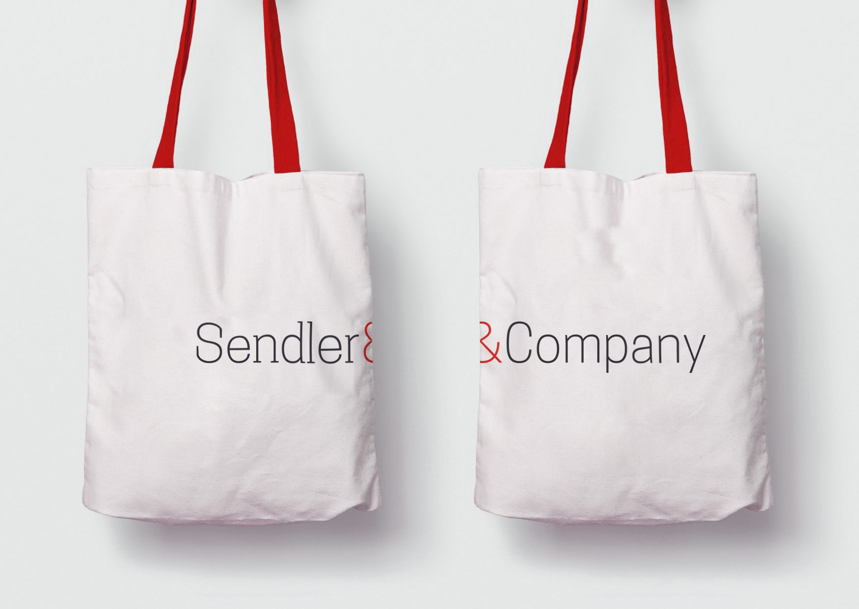
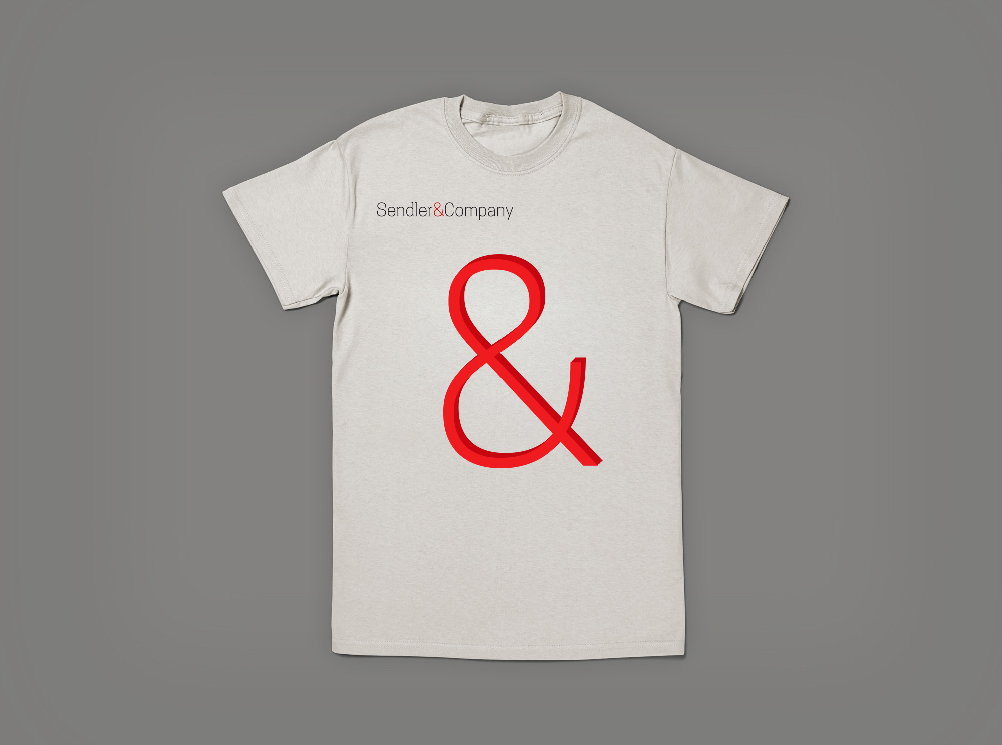
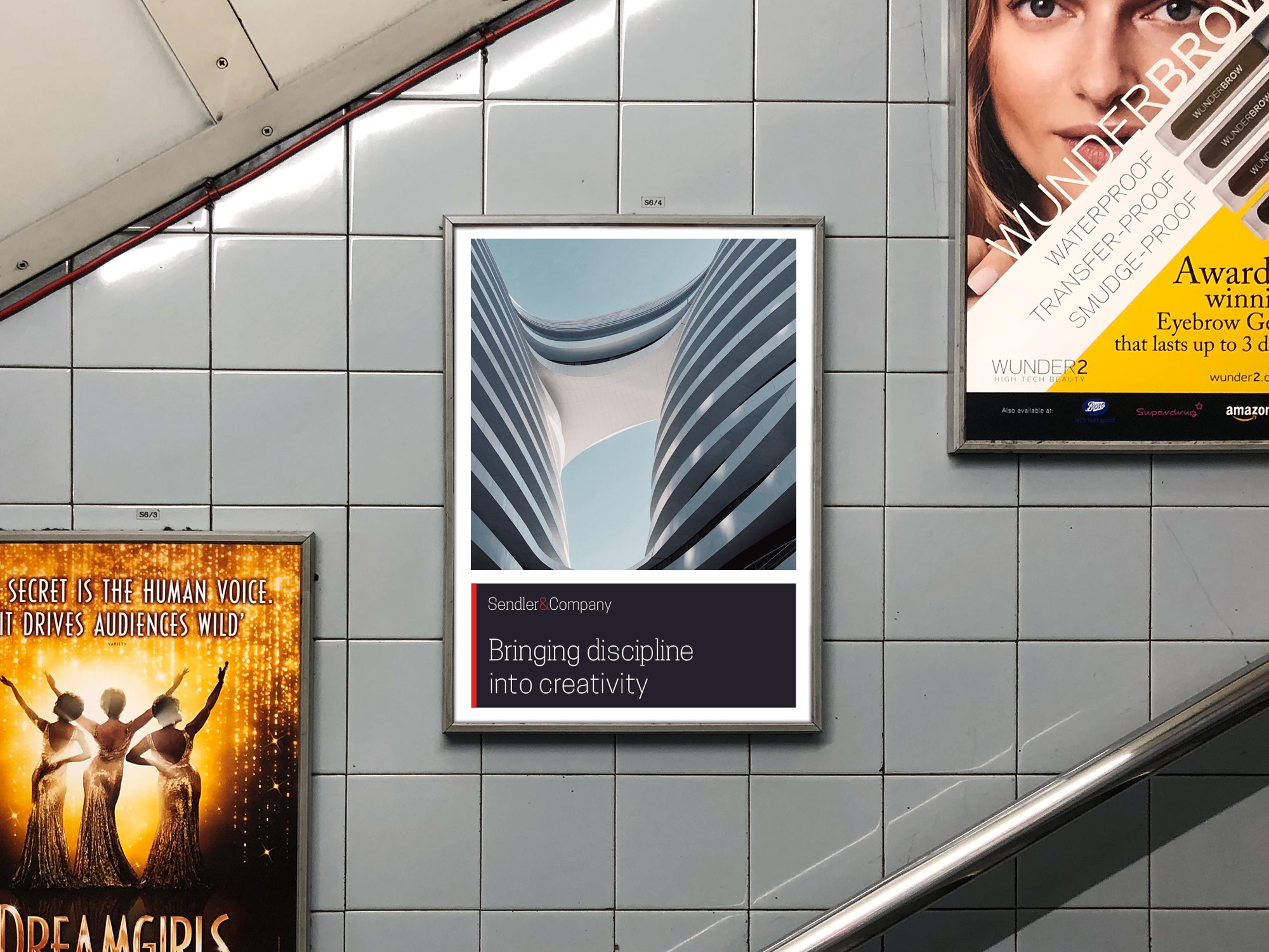
Sendler&Company is an international consulting company, providing services as engineering and design, construction management, leasing models, etc. In 2019 we have completed full branding for our Client. The whole concept is built on combining discipline and creativity/innovation. We have used two typefaces — slab one for the disciplined part and sans serif for the innovative one. & sign combines it all.
Sendler&Company has offices in 7 countries including Germany, Hungary, and Russia. We do hope our client will gain huge access to any aspect of their business.
We are still closely working with the client. Including the development of an official company website sendler-company.com. Below you can have a look at some of the branded elements created by our team. More to come in our portfolio.
2020 is gonna be an important year for us. We have opened the new site after 8 years of using our first one created in 2012. We are opening a representational office in Charlstone, the USA. Moreover, we are reconsidering our work moving to a deeper understanding of the real needs of our customers.
It has been a long journey to find ourselves where we are now. We are proud of everything we have, yet we understand it is time to take the next step and change the way we approach the work. We should become more responsible, more clear in the message we make. Any client coming to our studio should feel the passion behind the work.
To explain in detail, we are hiring new professional specialists with deep experience in marketing, copywriting, digital promotion and web development. We develop a new process of approaching projects. We create new guidelines and standards of quality. We are starting to provide branding expertise and advertisement services. What’s the most important, we are planning to provide services at a higher level than we ever did before. What we can promise we would do our best so any client coming to use would be absolutely happy that he or she trusted our team.
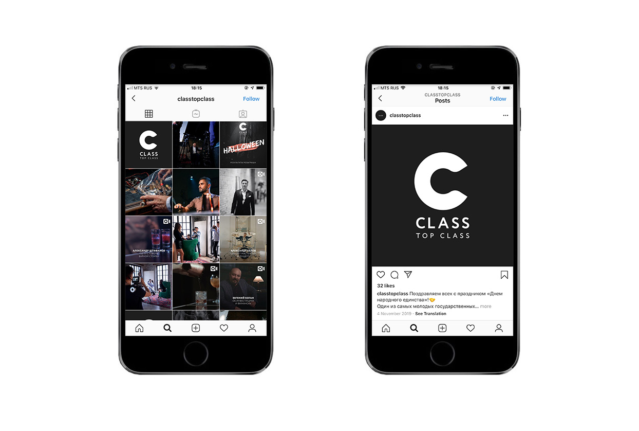
We are a bit nervous but happy before our journey. Let’s see what it brings us. Hope you would be glad to join us!Class TopClass is Russian analogue for Masterclass, famous and trendy portal. TopClass provides users with masterclasses that are relevant to Russian-speaking users. The project has started in 2019 and first classes were dedicated to investing, photography and cigar smoking.
We have created an identity for the project — starting from logotype and all the way to the branding guidelines.
We have created a vast amount of layouts, especially for digital production. Our client is using the manuals and quite satisfied with the level of communication they are managing to gain using the graphical language.
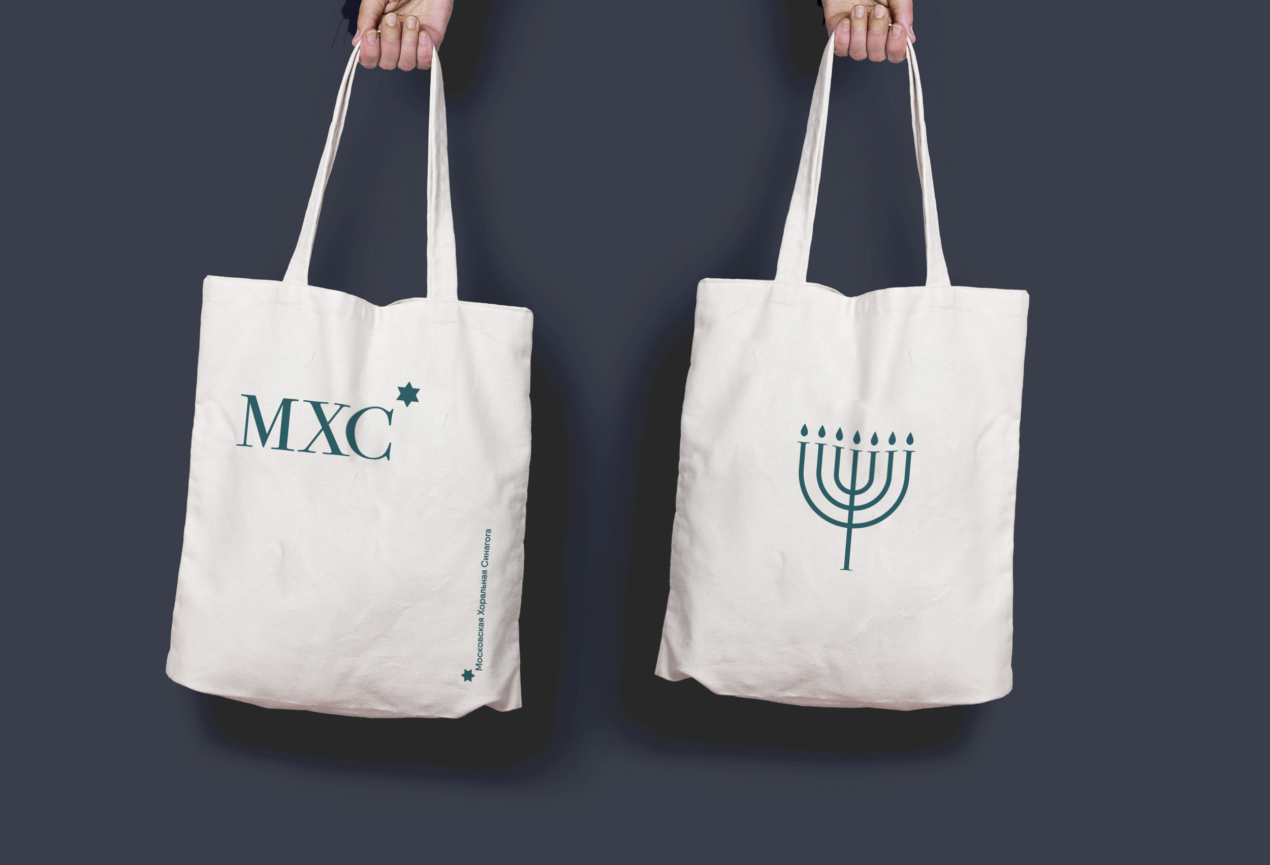
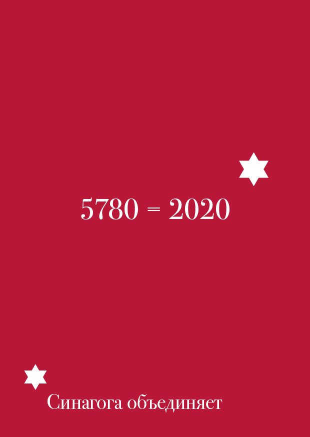
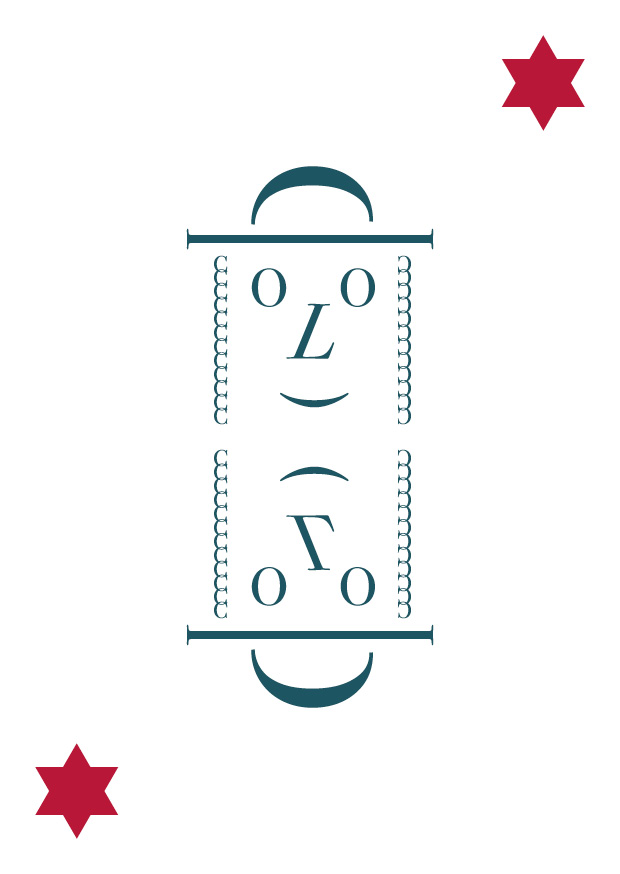
Moscow Choral Synagogue is the oldest one and plays a significant role not only in the history of Jews in Moscow but in Russia. Founded at the beginning of the 19th century it is still one of the most important places for Moscow Jews. It was a great honor for us to create an absolutely new brand that would be used as a graphical language to communicate with visitors and that would allow attracting new generation into the Synagogue and its social life.
The new identity is based on the abbreviation typed with Bodoni and adding an apostrophe in the form of the star of Judah — central sign for Jewish tradition. Thought using the sign can seem to be cliche’d we managed to integrate it in a new and fresh way.
It was a great pleasure to work on the identity of such an interesting and historically rich organization. We have always been big fans of Jewish culture and traditions and we do hope a new identity would allow the client to gain more popularity and visitors.
We are glad to start our new site. We have been working on it for nearly 2 years. Hopefully, now we would be able to able to demonstrate our work and team capabilities in a more proper and solid way.
Our old site was active since 2012 and for 8 years it has lost its attractiveness.
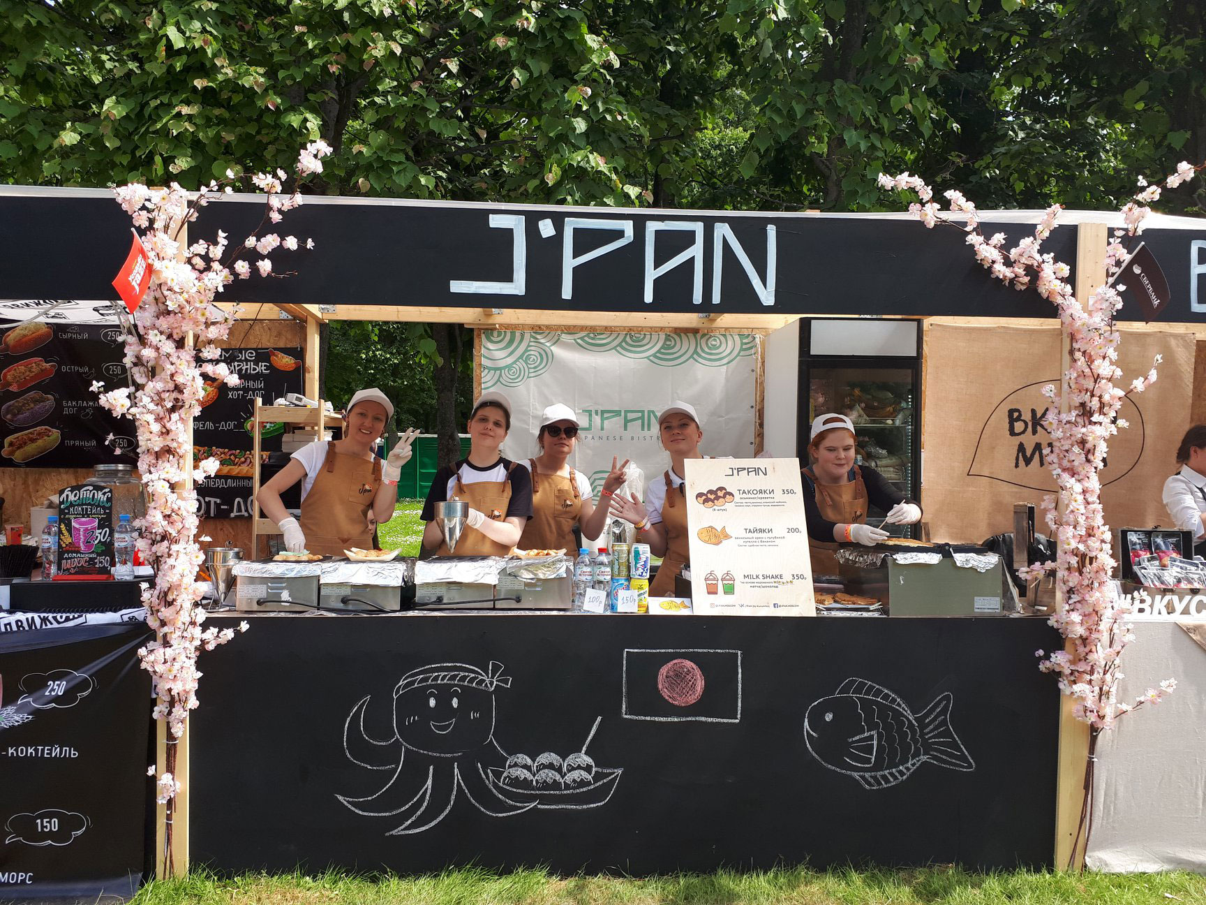
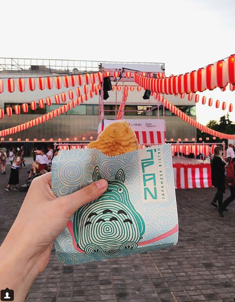
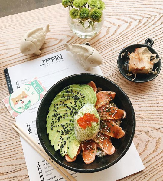
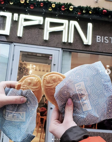
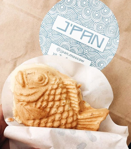
In 2018 we have been working on the branding of J’PAN restaurant — Japanese bistro in the very heart of Moscow with a unique concept of urban Japanese food instead of familiar sushi and roll oriented cafe. It definitely was one of the most global and important projects for us for many reasons. And the result was astonishing. In 2019 the restaurant was named among the best ones in Moscow. We hope our contribution was also significant.
It is important to note that in 2017 the bistro started as a street point participating in different festivities. Now it is a brand known name.
The award Bay Leaf annually names the best restaurants of the year in Moscow. In 2019 J’PAN was named between 50 best restaurants of the year and also was rewarded as “The hope of restaurant business” as the concept and its execution impressed the jury.
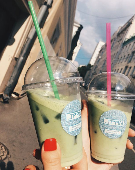
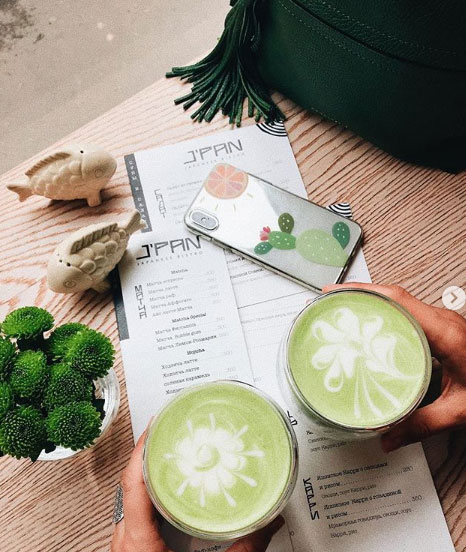
However, we suppose the most valuable feedback is the one the restaurant receives from the visitors. You always can visit the Instagram page to see the positive feedback and beautiful photos made by them.